Infographic Wireframing
After deciding the path I want to take with my infographic- which is an infographic based on trees. I have created some wireframes to see what the best layout will be for all of my facts and statistics about trees, I have began this process by sketching up some paper wireframes.
Paper wireframes
I sketched out a landscape layout and a portrait layout wireframe, from my previous research I have seen both layouts used in infographic design. However the majority of infographics take the form of a portrait style and I think that this option will suit my tree infographic also, I think that my information and the overall story of this infographic will flow much better in a portrait style layout.

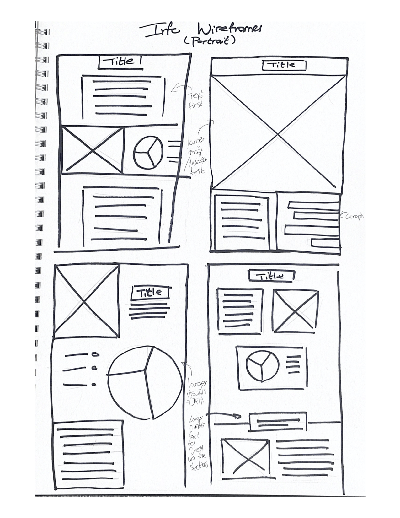
A wider range of paper wireframes in a portrait layout
I tested out some more portrait style layouts, exploring the idea of an image first or text first, the title in the centre or a beginning with a data visual. I think I prefer the idea of a banner across the top of this infographic with my title- ‘The Tree Infographic’ and underneath that include an intro with an image or illustration beside it. this feels more balanced to me.
Digital wireframes
After deciding on a approriate layout for my infographic on paper I went to Figma and began to build it digitally. I find that this step really helps me when it comes to design and building the final product, to see the different sections and where my elements and information will go and I can see it slowly coming to life.
Starting simple
I began with a very simple wireframe to get my hierarchy of information in the correct order. With my infographic I want to tell a story about trees so the hierarchy of information needs to make sense. I have decided to go for an intro section at the beginning, then move down into deforestation and then talk about rainforests and then into the re-plantation of trees. I think this layout of information flow nicely.

More detailed
After figuring out what each section will be based on I have went back and created another digital wireframe with more detail. I have included the placement for data images and illustrations and text.

Back to paper
Adding more detail about content
I wanted to go back to paper, I felt like I needed to plan more about what content I actually want to include in each section of my infographic. I used sticky notes at the site of my wireframe and I listed topics of interest that I want to include within each section, making for a more organised and better laid out infographic.

Reflection
I am happy with my exploration with wireframing here, I think I am improving in this area well. I need to take these wireframes and begin to develop this infographic digitally. I feel more organised with what information I am actually putting into infographic and where I need to place images and what images I need to create. I will begin to focus now on the elements that I will include in this in more detail, including sketching what illustrations I want to include and creating them digitally and beginning to build the data visuals.