My thoughts on the movie- Helvetica
For further font research I decided to watch the movie Helvetica. This is my chosen font for my specimen screen and therefore I felt as though it would give me a good overlook of the history, as well as the modern day use of the font.
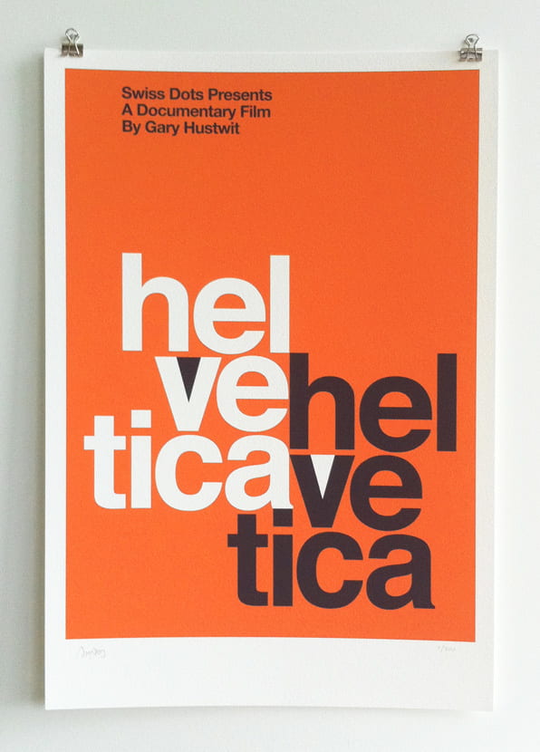
Gary Hustwit was the mind behind this 2007 movie, he talks about the history of the typeface and interviews leading graphic designers and type face designers throughout the movie. Hustwit highlighted the personalities that are behind typefaces in todays society, which was nice to see and hear diesinkers feelings and enthusiasm for the area of typography. From watching Helvetica I have realised that the publics view of Helvetica is really 50/50, designers either love or hate this typeface. I really liked hearing different designers opinions on the typeface and their thoughts on the subject of typography. Some of the designers had some positive, eye opening quotes about the typeface, here are some examples:
- “For me Helvetica is just this beautiful, timeless thing. And certain things shouldn’t be messed with, you know?”(Michael C. Place)
- “The meaning is in the content of the text and not in the typeface, and that is why we loved Helvetica very much.”(Wim Crouwel)
- “And Helvetica maybe says everything, and that’s perhaps part of its appeal.”(Jonathan Hoefler)
- “And I think I’m right calling Helvetica the perfume of the city. It is just something we don’t notice usually but we would miss very much if it wouldn’t be there.”(Lars Müller)
I really like these quotes especially the first one I mentioned, I think it could make for a really effective poster. On the other hand there was a complete 180 regarding the opinion of this typeface, some designers had this to say,
‘
- “Why is — bad taste ubiquitous?” (Erik Spiekermann)
- “And it’s hard to evaluate it. It’s like being asked what you think about off-white paint. It’s just — it’s just there.”(Jonathan Hoefler)
- “Helvetica is good for typographers who do not know what to say.”
- “A real typeface needs rhythm, needs contrast… And I’m sure our handwriting is miles away from Helvetica or anything that would be considered legible, but we can read it, because there’s a rhythm to it, there’s a contrast to it. Helvetica hasn’t got any of that.”(Erik Spiekermann)
I really liked hearing different designers opinions on the typeface and their thoughts on the subject of typography, the positive and the not so positive. I found it beneficial that each designer explained their opinions and criticisms of Helvetica, why they felt the way they did about it.

I also got to think about the typeface in different ways, for example one of the designers talked about how Helvetica is all about the shapes that are made within letters which I had never thought about before. From reflecting on this idea I have discovered that I really like the ‘a’ in the Helvetica alphabet and the shape it makes in the middle of the letter.
What did I learn?
From watching this movie I discovered the directors aim was to show Helvetica’s beauty in its simplicity and clear cut clarity. I feel as though these 80 minutes have given me a good background and history of the typeface, as well as an overview of how it is used in everyday life. How it was made and why it was made. Helvetica is everywhere and most of us don’t even realise and I think that is what I like the most about it, it’s simply there.