Kyle Tezaks work stood out to me because I loved how he used simple geometric shapes to create beautiful designs and iconography throughout the identity. I love how each part of the identity was created by one of these repeated geometric shapes throughout and the level of consistency throughout is something I aim to have in my own brand identity
Brightwork
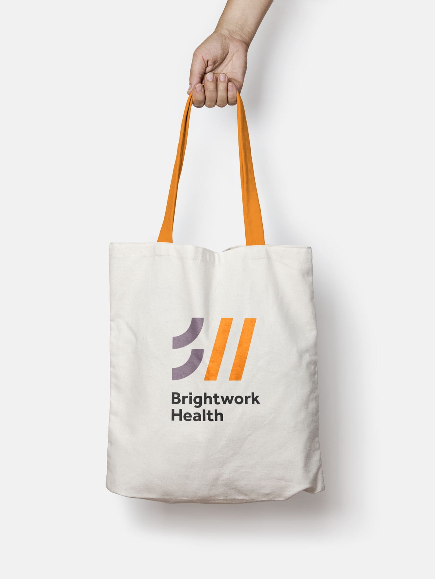
Brightwork health has creates platforms that provide assesment, analytics, and education, to healthcare professionals. Their visual identity needed to avoid an overly conservative, corporate design style that usually would be associated with similar organisations.


The elements that make up the logo and also simple lines and geometric shapes are once again used in his work in order to create well thought out colourful illustrations and patterns that tell a story and draw attention to the type of work Brightwork does.

I love how the same shapes carry forward into the logo of the company too. this is something ill aim for in my own brand identity