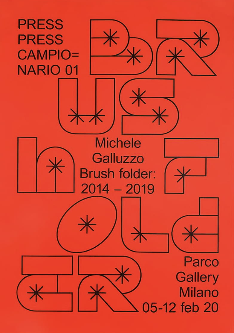
RYTER & ITC GARDE GOTHIC
The display typeface used is Ryter and the secondary typeface is ITC Avant Garde Gothic (1974) by Ed Benguiat, used in all caps. Some elements to the Ryter typeface are additionally modified, like the swash entry stroke on V, or the hyper-extended T bar, among others. The letterforms were further enhanced with a bevel effect and a double underline. The second line, “Soul in Sapphire”, uses Ryter largely out of the box – apart from the white contour, the addition of a swash on the final E is the only customization.
I love the personality of this display text and the way the letters are mainly sans serif with some extended glyphs added on as extras. I like the two different variations of this typeface too in this poster – one being very 3D, shiny, and gradiented, and the other being flat with a simple white stroke around it.
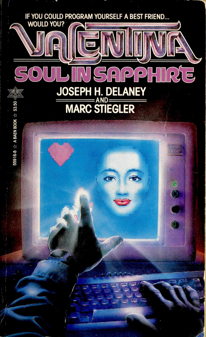

ALDIVIVA & HELVETICA NEUE
These typefaces are paired in the sleeve and booklet of Ekl Hardwicks album, “8” . The typefaces used are Aldiviva (as the display typeface), and Helvetica Neue (as the secondary typeface).
I like the style of this typeface due to the very distinctive shapes of the letterforms. I think this typeface looks best when a stroke is created and there is no fill included. It decreases legibility significantly however i love the way this means each letter stands out as a work of art in itself. The purpose of this typeface when used in this way isn’t to convey information but to create a very specific brand style. The use of Helvetica Neue underneath allows the key information to be read and so balances the extremely illegible stroked “aldiviva” typeface with a perfectly legible, well known typeface.
This pairing has taught me that illegible, overly ornate or artistic typefaces can be used as display typefaces sometimes, however only when paired with a main body text that is easily understandable and doesn’t leave the viewer having a difficult time reading it.


OROBAN (BLAZE TYPE) & CINDIE MONO
Ostudlez or Zoé Abravanel is a French graphic designer. For her studio website, she uses Oroban (Blaze type) as the typeface for text and captions. For the wide, mono spaced sans serif at the top she uses Cindie Mono. I like how bold and striking this choice is. Before analysing this website I didn’t fully realise how well an ornate, thin sans serif could work when paired with a bold, striking, and blocky display typeface.


BRASS & ARIAL
I love how the letters in these works can be incorporated into creating patterns and add to the layout of posters. I think this may be because the letters are all made up of very basic geometric shapes, like ovals, squares, and rectangles. It’s reasonably legible which would be useful for important headings, and its bold and striking enough to stand out a lot to the viewer too – enticing them to read it. When paired with a very legible font – Arial in block capitals it creates an attractive balance- allowing for the publication to communicate its message effectively while also creating an interesting visual effect.