Deciding on our topic
The second project for our module was to create a presentation based on one of the following titles:
- Bauhaus and the New Typography
- Design Systems for the Olympic Games
- The Influence of Modern Art
- The Modern Movement in America
- Pioneers of Postmodern Graphic Design
- Pioneers of Web / Digital Design
After reading about each topic I found I was most interested in researching both the influence of modern art, and the pioneers of post modern graphic design.
When researching post modern graphic design, I found myself being drawn to the range of bright, neon colours used as well as the disorderly appearance of the designs. After some more research I found that postmodernism was influenced by modern art movements such as cubism, pop art, comic art and dadaism.
April Greimans work interested me a lot when researching postmodern graphic design. She was one of the first people to recognise computer technology as a tool for design:
 April Greiman. “Does It Make Sense?”

April Greiman and Jayme Odgers. WET Magazine
I love the inclusion of geometric shapes in random positioning combined with rotated images in different sizing. Despite the disorder the piece is aesthetically pleasing; I like the way it goes completely against the standard way of design (using grid layouts and a strict colour scheme) which was influenced by the Swiss style and the Bauhaus and instead relies on pure intuition to decide on where objects should be placed.
When my group and I discussed our presentation topic we realised we all had a shared interest in art movements and art history in general. As I have more of a background in art more than design I felt this was a great opportunity to talk about something I’m passionate about. After my research into postmodern graphic design I wanted to know more about the influences behind it too (a lot of which were modern art movements).
Our chosen title – “The Influence of Modern Art”
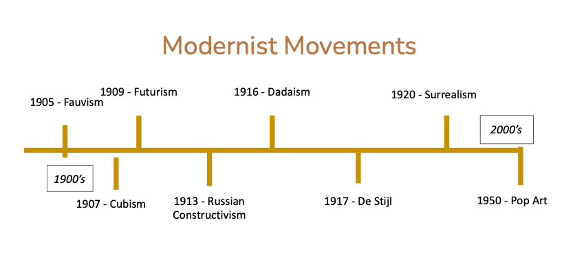
When deciding the structure of our presentation, we realised we had to choose a select amount of the modernist art movements from 1900 to 2000. There were many to choose from and so we decided to only select the most influential throughout history:
We decided that choosing 8 art movements would be the best given our time limit. That meant that we would allocate two to each person in the group. Next we chose the order in which they came in, we decided that organising them in chronological order would make the most sense. We created a slide at the very start of the presentation to demonstrate visually when each movement took place:
I was chose to research Russian Constructivism as well as Pop art:
Russian Constructivism:
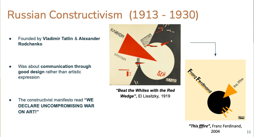
Russian Constructivism was begun in 1913 by Vladimir Tatlin and Alexander Rodchenko. Both Tatlin and Rodchenko rejected the idea of traditional art in favour of using art for social purposes. Constructivist art was used in architecture, design, fashion and mass produced items and images.
The rest of Europe was being influenced by Neoclassicism and Art Nouveau at the time after the Russian revolution. Russia was creating an art form that was based on simplicity, pure lines, and geometry in design that was inspired a lot by mainly Cubism and Futurism. (two other modernist movements that we talked about in our presentation).
In 1922, the constructivist manifesto was created by Aleksei Gan and in obtrusive uppercase letters read: “WE DECLARE UNCOMPROMISING WAR ON ART!” Many people were angry at the idea of constructivism for the reason that it threatened traditional art which was made for purely aesthetic reasons, or art which had traditional symbolic meanings or themes.
El Lissitzky was also a constructivist artist. He created the poster – “Beat the Whites with the Red Wedge” a poster that’s symbolic of the propaganda used leading up to the Russian civil war.
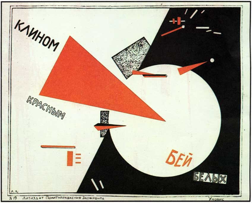
The principles of constructivism were to reject any form of realism and make use of simple shapes such as the circle, square and triangles. There was also a limited colour palette, using mainly red, black, green, white and blue.
This made the art easily understandable and engaging for the viewer. Lissitzkys work is a great example of this – it was so effective that the modern Scottish band Franz Ferdinand were inspired by it in 2004:

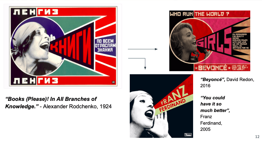
Alexander Rodchenko was a pioneer of Constructivism. He first worked as a graphic designer and later moved onto photomontages and photography. One of the most recognisable of his posters is his image of Lilya Brik.

Its combination of photography with modern, geometric design has influenced many, for example another album cover by Franz Ferdinand and a 2014 poster of Beyonce by David Redon.

“You could have it so much better” – Franz Ferdinand

“Beyonce” – David Redon
The Constructivist visual style of heavy contrasting colours, geometric shapes, and flat colours is still recognisable in design today. It influenced major 20th century art movements such as the Bauhaus and De Stijl and actually transmitted via the Bauhaus to the Swiss designers of the 1950s and 60s. They developed the International Style that sets the parameters for a wide variety of design today.
Russian Constructivism was declining by the mid-1920s. But it would continue to be an inspiration for western artists, creating a movement called International Constructivism which was popular in Germany in the 1920s-1950s. It also influenced major trends such as the Bauhaus and De Stijl movements.
Kasimir malevich was a suprematist artist who worked in a style that was geometric and minimal too. He created many posters made up of only geometric shapes. His most famous piece of work known as “black square” and it simply consists of a block colour black square right in the centre of the page:

“Black Square” – Kasimir Malevich
In 1927 in his book “The non objective world” he said that “In the year 1913, trying desperately to free art from the dead weight of the real world, I took refuge in the form of the square” The principles of Suprematism were to reject any form of realism and make use of simple shapes such as the circle, square and triangles. There was also a limited use of colour scheme in the palette, only making use of colours such as black,red, white, blue and green. The purpose of this was to make the information being communicated easily understandable and engaging.
Pop Art:
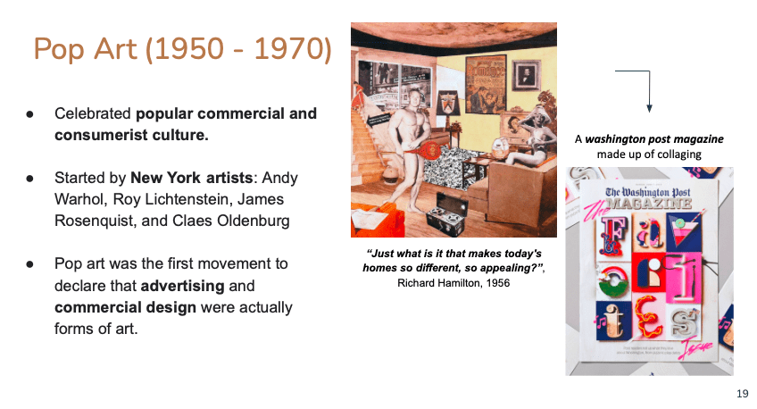
Pop art is a movement that flourished in the 1950s and 60s in America and Britain. It emerged in the post-World War II period at the same time the US was undergoing the post war consumer boom. Pop art started with the New York artists Andy Warhol, Roy Lichtenstein, James Rosenquist, and Claes Oldenburg.
Pop artists wanted to move away from the themes classically explored by fine art such as morality, classic history, religion and myths. While they could appreciate fine art, they couldn’t find any correlation between it and the lives that they were living. They wanted to close the gap and make art that connected on a personal level with the people of the time.
Pop art uses images and icons that are visually familiar and popular in the modern world. This included famous celebrities, commercial items like soup cans, soft drinks, and comic books. Images were varied using techniques such as repeating the image, changing the colours of the image, and using collage.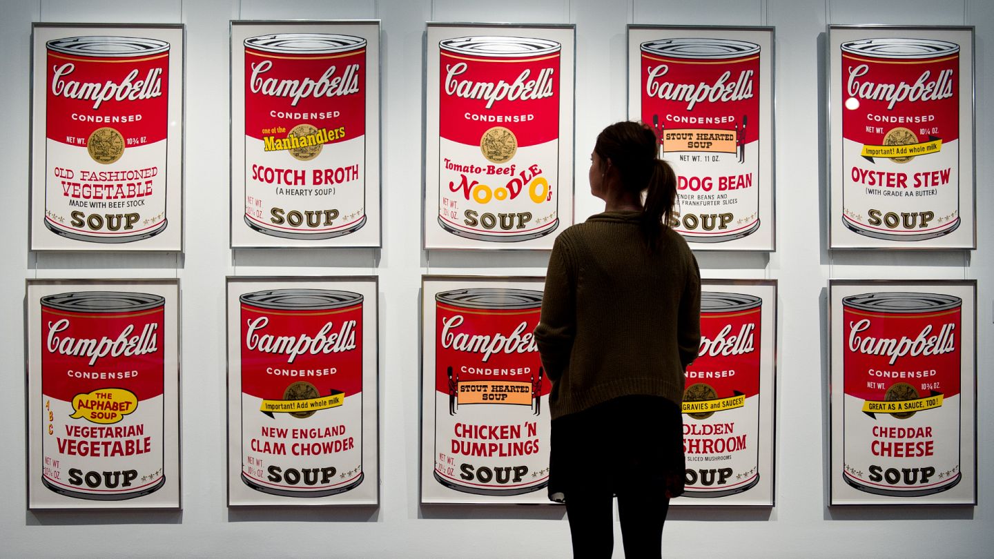
“Campbells soup cans” – Andy Warhol
One of the most influential techniques is collaging. Richard Hamilton started this and his most famous piece known as “Just what is it that makes todays homes so different, so appealing?” is created exclusively from American magazine cuttings.
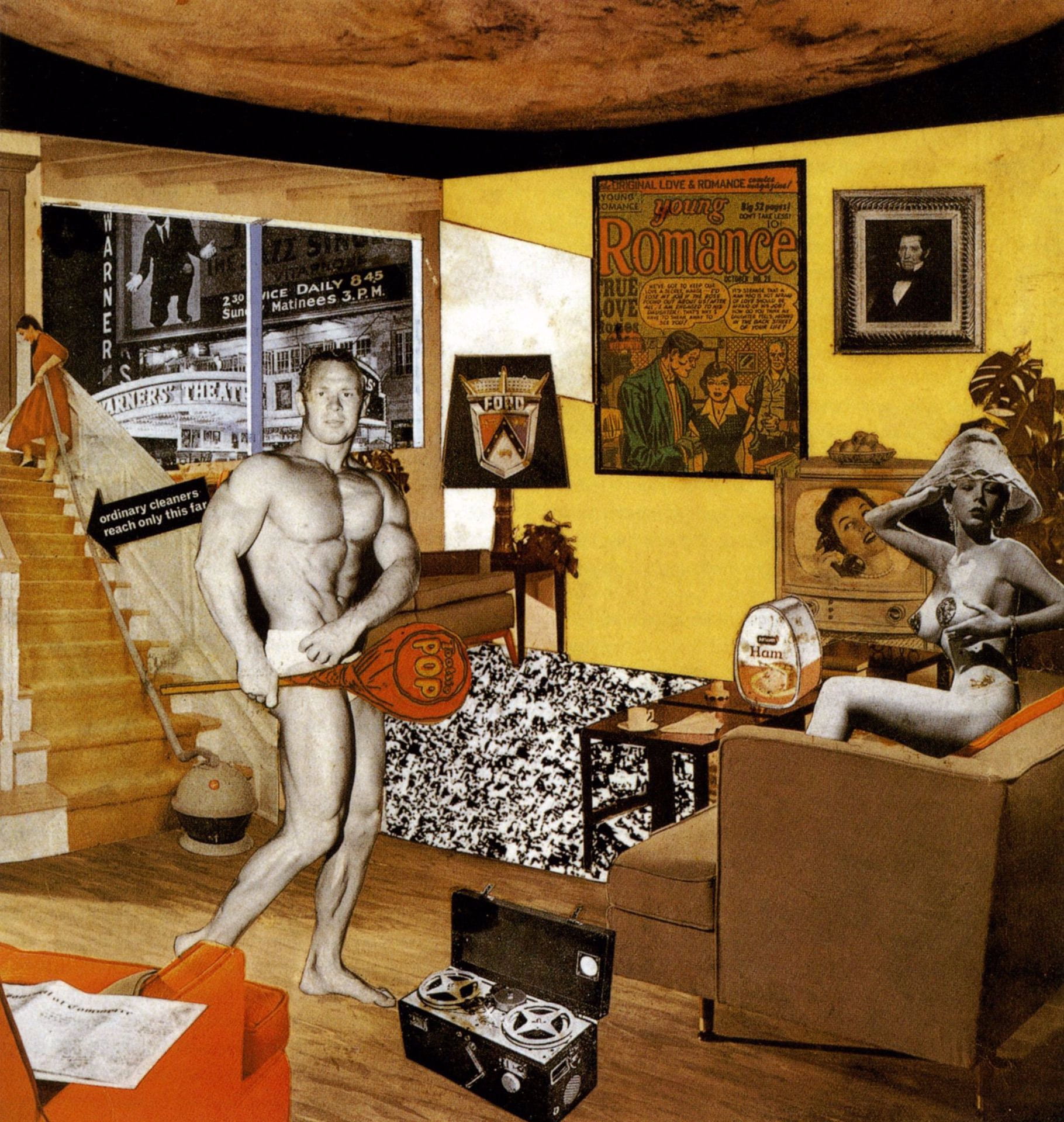
“just what is it that makes todays homes so different, so appealing?” – Richard Hamilton
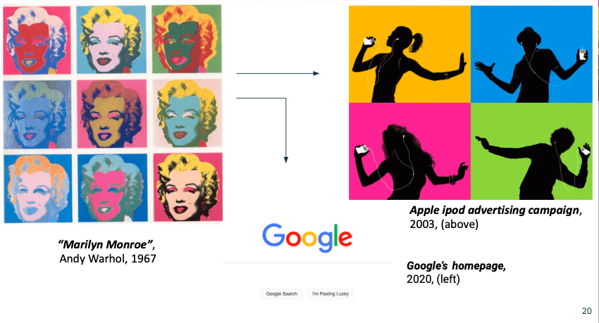
The visual effects of Pop Art are created via the reproduction, overlay, and duplication of various images. Andy Warhols Marilyn Monroe silkscreen prints are a great example of this.

Andy Warhols “Marilyn Monroe” silkscreen prints
We can also see pop art’s influence on the sleek minimalism of Apple’s branding, and in the simplicity of the multi-coloured font in the layout of the Google homepage.
This advertising campaign featured repeated silhouetted characters against brightly coloured backgrounds. This change of strategy was a very successful one for Apple who usually advertised their products in a high-quality photograph on a white background.
After research into pop art I realised that many of the genres of marketing, advertising and branding that pop art had initially drawn influence from back in the 50s and 60s now actually take inspiration from pop art itself.