My Final Design
When the Netflix app opens up and you have chosen your account, it will bring you to Netflix home page as usual. However, with the addition of Hive, if you press the H logo next to the casting symbol, you will be taken to the Hive home page.
When you press a title either on Netflix or Hive the same screen will be presented with options to Play, Download or open in Hive. When a title plays it will be played through Netflix and you will be taken back to that side of the app when doing so. Just below these options, are the buttons to quickly add the title to your Hive list, rate the title, or share the title with one or multiple of your Hive friends (which brings you to the friends screen).
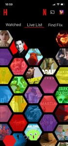
For the most part the Hive Home Screen looks very similar to the Netflix Home screen only the N and H have swapped places (to indicate which part of the app the user is on) and below the carousel of titles is the option to view your Watched list, Live List and Find Flix. Your Watched list consists of the things you’ve already watched and this is where you find the titles you feel or good or bad enough to share with your friends. The Live List option displays the titles you have added to your list either via Find Flix or by pressing My List inside a title screen. This is displayed in the honeycomb layout where you can pinch to zoom out or in and navigate all angles. The final option is Find Flix which is a quick and fun way to either add a title to your list to watch in the future or to find a title the you want to watch instantly, without facing side scrolling walls of movies or series. To add a title you swipe left on the image presented or press the red tick below and the title will move to the left. Alternatively if there is a title you don’t want to watch and aren’t interested in, you can swipe right and decline or press the x below and the title will move to the right of the screen. This is the main attraction of my app, alongside the social media aspect.
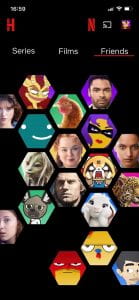
Films, Friends and Series are also displayed in the honeycomb layout with the titles that are recommended by friends given in a colour coded system that the user can toggle on or off by pressing the red hexagon outline in the bottom left of the screen to make it fill red and turn on the coloured overlay. This function is in place to make Hive easier to navigate without needed many different screens within screens and to get a quick view of which friends recommended what without having to go in search for it.
I also created PSD Mockups on PhotoShop to visualise what Hive may look like in use.


