
-
Upload 3 found icons (online) and write 200 words describing the visual language in relation to SOME of the following: style, function, emotion, language, movement, grid, structure, abstraction, colour.
The twitter icon has become incredibly well known with the rise of social media yet hasn’t developed much since 2012, with a simple blue background and a little cut out of a ‘tweeting bird’. This icon embraces the simplicity of flat design using circular shapes and that trademark twitter blue fits in with the apps overall theme however the image of the bird alone would now be enough to recognise this logo as Twitters own.
![]()
Google Maps
The google maps ion is one which has went through quite a lot of changes however the colour scheme is one thing that has stayed true to google’s design, the use of the original google colours as well as the small G at the top works really well in distinguishing it as a Google App. The style is rather simplistic again using flat design and very basic geometric lines and shapes to create an abstract design of a map then paired with the pinpointer on top which has been part of the app for a long time.
![]()
Apple Photos
Apple has went through a lot of iOS updates through the years however after the release of the iPhone 5 they used a new theme, changing their own app icons to a new and more abstract designs. we definitely see this with the new and improved ‘Sunflower’, we see the original design updated with a more simplistic and flat laid as opposed to the yellow illustrative sunflower we saw before. Using increased and decreased layer opposites it gives the icon a really interesting blend combined with subtle gradients within the shapes
![]()
-
Select a designer and write 100 words describing their approach to developing a visual language and how it informs contemporary icon design.
Susan Kare
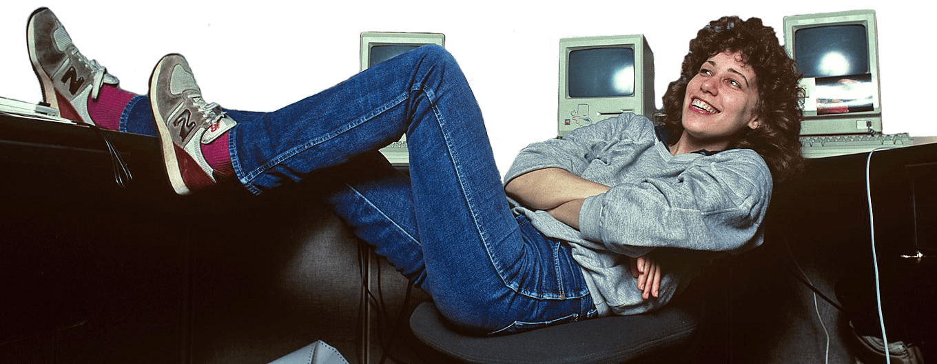
Kares key to Icon Design is to keep things simple she describes in a lecture in San Francisco Public Library 2020 that, ‘If you reduce anything, it’s easier for everyone to see themselves.’ implying that the less detail you use, the more universal the icon. A lot of her research came from books inluding the ‘Symbol Dictionary’ when she was stuck she would draw things using graph paper, now her sketchbook designs are ionic within themselves. She emphasises the importance of researching the brand and having fun with a personal touch.
![]()
![]()
Bibliography