Artist research- Isabella Babola

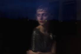
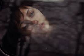
Isabella Bubola is famous as a model, but she’s also a fine art/portrait photographer. It’s inspired by surrealism, colours and dreams. Isabella has her own website where you can see her work both as a model and as a photographer. She’s also a blogger who shares fashion and self-portrait photography tips with her followers. Croatian photographer Isabella Bubola’s self-portraits show that portraiture is timeless, with an endless number of avenues for a photographer to convey a new image, as she presents a rare vision of her world so that we can see her in her concentrated state. Isabella’s fascinatingly stunning self-portraits cause us to get close enough to see the close-up details of the model.  

 Bubola is inspired by many things including; Travelling, movies by Xavier Dolan and Sofia Coppola, overheard conversations, trip-hop music, paintings by Toulouse-Lautrec and Degas, fanzines, books (Harry Potter, A Single Man, The Perks of being a Wallflower, Carol, The Hours), TED Talks, podcasts (Debbie Millman’s ‘‘Design Matters’’ and ‘‘99% invisible’’). Bubola’s works have been shown in a number of group exhibitions. In her photograph, she attempts to capture both the mood and the feelings, because she feels that emotions will create a connection between the spectator and the work of art. The mixture of Isabella’s delicate, elf-shaped face and her preference of sharp backgrounds and a fading palette both serve to create a surreal, otherworldly imagery.  

AAD011- Communication

Communication is essentially the process of transmitting information from one location, individual or party to another. Each correspondence requires (at least) one sender, one message and one receiver. Communicating helps people to express their opinions and concerns, and at the same time helps one to understand the sentiments and thoughts of others. As a consequence, love or dislike towards others will grow, and positive or negative relationships will be formed. A good logo concept is the one that interacts seamlessly with its target audience. This ensures that the emblem has to be able to communicate and connect with fans in several respects. Such a logo is necessary to turn people into prospective customers and then loyal customers.

Mercedes features its signature clearly on all of its cars and ads without any lettering making it look bold and communicative. With decades of brand recognition, the organisation can quickly tap into customer universal experience. But the famous Mercedes star also includes an underlying meaning; the three pins represent air, ground and sea; each segment of the automotive industry. The silver colour of the logo evokes reliability, stability, professionalism and conventionality along with value and consistency. Compared to other brands, the Mercedes typeface is thin and curved, giving it a touch of elegance; exactly the impression that the company needs to create.  


Philip Hyde Photography

Raised in San Francisco in 1921, Philip Hyde was a figure in the West Coast landscape style, creating his first wilderness photographs of fine art landscape in 1942. His images helped to preserve national treasures such as the Grand Canyon, the Dinosaur National Monument, Denali, the Tongass National Forest. 

His art was always ahead of his time and reached far beyond the classical landscapes for which he is recognised. His distinctive photographic vision and novel compositions are now commonly emulated. It is widely regarded as one of the most influential landscape photographers in the world. Two of his most popular photographs are his 1964 colour conservation symbol, “Cathedral In The Desert, Glen Canyon,” The American Photo Magazine called one of the top 100 photos of the 20th century and “The Minarets From Tarn Above Lake Ediza,” a vintage black and white photograph shot in what is now the Ansel Adams Wilderness in the Sierra Nevada Mountains.  

I am interested in Hydes photography because he often accentuates nature’s most tranquil features, creating a serene and quiet tone to all his photographs.  

embellishment challenge

For my embellishment challenge, i focused mostly on stitching and stencil work throughout the process. The shirt was firstly dyed an off white/brown colour, however the colour managed to fade whilst drying.

I stitched into the collar of the shirt, “my body, my life”, signifying how my project is based around body positivity and acceptance.

I pre stitched some drawings that i them stitched onto the chest and the sleeve of my shirt, still maintaining the colour scheme of my project. i also added some designs on both the cuffs and the sleeve of the shirt. on the other side of the chest, i attempted stenciling, however the colour was not as vibrant when dry so i decided to outline the image with stitching.


Identity Contextual research AAD011

I chose this image by John Holcroft to demonstrate my take on identity because I feel as if it speaks loudly about self-identity and how social media has too much of an influence on how we perceive ourselves nowadays. Our generation at this day and age, lives on social media that much that they develop a social media identity and an unrealistic image of how we should look, making others feel insecure about themselves, clearly reflected in the image. The image meditates on how others put themselves down when looking at how society wants them to look like.


stencil art


i attempted using my natural dyes as inks for my stencils. they did work okay but i feel as if they were too watery and not thick enough to make the end result more pigmented.

The dyes often leaked and smudges the pages, as shown above, however, i went over the outline with an inky biro en to show the figure.


stitch and fabric experimenting

When trying to create a series of experiments based off the word ‘Naked’, I felt as if body positivity and acceptance is a strong basis for what I want to continue working on. I began staining fabrics with my natural dyes that I created on one of our previous workshops as well as some new dyes. I used a running stitch majority of the time to draw out figures and quotes that relate to my project. In the piece above, I took an a4 piece of fabric and began to sew a figure and outlined some parts of her body that she does not feel happy with using red thread to amplify her worry. The fabric dye and rugged look of the stitch created an old, deteriorated ambiance, reflecting how she figure may feel having not feeling satisfied with her body.

Similarly, with this piece I took an old bra and used it as a base for my stitch, in attempts to send a message about body acceptance. Woman nowadays are crowded by the pressure to look fitting and pleasing to the public eye; the perfect waist, perfect bust, perfect face; i used a bra along with a measuring tape, highlighting the pressure and demand to look a way that is merely unrealistic.

I want to expand on both these pieces, perhaps expending the stitch onto a larger piece of fabric or creating a more powerful image or quote.

Mark Making and experimental sketchbook start


When attempting this method of bookmaking, I personally did not like it at first, however, as i kept experimenting with folding it, staining it, and using coffee granules for texture, I ended up enjoying the process. I do feel like i could improve on this process more in that I could take every individual box of the folded book and give it its own individual design. I will attempt t continue and improve this experiment as the week pursues.

I continued to experiment with more ways to create a sketchbook. I attempted to use textiles and sewing to display some of my mark making and I was surprisingly pleased with the turn out, however I would like to continue to improve and expand on it.

I also created a sketchbook with a combination of some Mark making and stitching pieces I created.