Tagged: typography

Week 4: Calligraphy

We were taken through a calligraphy tutorial so we could try and form our own letters. I used a black ProMarker with a chiselled tip, and I found it quite difficult to get used to at first, but ultimately this proved to be an interesting task and I would like to keep practising to try and improve at calligraphy.

Week 3: Anatomy of Type with Name

I enjoyed this typographic exercise a lot, as it allowed me to research the anatomy of type as I identified each part of the letters in my name. I chose Trajan Pro Regular as my typeface, which admittedly made it somewhat difficult for me as most diagrams of type are based on lowercase characters, and Trajan Pro is an uppercase typeface. However, I managed to find several features of type within my name. I thoroughly enjoyed this task, as I am used to doing similar work in Adobe Illustrator from courses I have done in the past.

Week 3: Experimental Letters using Household Objects

We had to do a short task, using objects or food in our houses, to create our chosen letter. I wasn’t sure if I fully understood the task at first, but I gave it a try. I made an uppercase A out of oranges. I like that an A might be more closely associated with apples, but I used oranges instead. My other letter was a lowercase A made out of my little brother’s Soreen snack bars in different colours. I much prefer the look of the oranges A, as it is clear, as opposed to the Soreen one, which is very busy due to the illustrations on the bars. I do, however, like the colours in the Soreen A a lot more, as it reminds me of a traffic light, and the colours are very vivid.

I enjoyed this task in the end, and think I was successful.

Week 2: Using Adobe Illustrator to make the Alphabet

Our digital task this week was to create shapes using Adobe Illustrator, after doing various tutorials using Photoshop and Illustrator. Once we were confident in this, we were given the task of creating the alphabet using these shapes, trying not to skew or distort the shapes too much, to keep the letters looking almost geometric, and to give it our own style. I enjoyed this task a lot, as I am confident using Adobe Illustrator, so I worked with each letter carefully, seeing what would look best and scrapping it if it did not resemble the letter closely enough. My favourite letters are the D, M, and Z, as I felt that they looked very interesting, but I am happy with how they all turned out. I also did numbers 1-10, and I think that the number 5 is very sleek, but I like the way the 8 turned out, as I did a lot of replicating shapes and rearranging them to get it to look the way it did.

Overall, I enjoyed this task and look forward to working in Illustrator in the future.

Week 1: Stencil Work

Our next task was to make stencils out of card or cardboard, and to use them with art supplies to create our letter on paper or other materials. I did the rune design again but chose to do it the right way up, but the design could always be turned on its side to resemble the Alpha I had done before. I drew the rune with black soft pastel as it was quite dark and noticeable on the brown card, and began to cut it out. Once I had done that, I chose a few different media to use. I went for paint splattering for one, painting the design for another, and drawing the outline using soft pastel for the last. As I am not yet too confident with stencil work, I think my first attempt was okay, but if I were to attempt this in the future, I might choose a different medium or use cardboard instead of card, as the card was quite light and flimsy.

Week 1: Typography in Signage

We had a task to go out and photograph examples of signs in our local environment. Our categories, from which we had to try and take at least one relevant photograph, were:

-Shop/commercial signs

-Wayfinding/directional signs

-Ad-hoc signs/posters/stickers, etc.

-Street signs

-Regulatory signs

-Architectonic (architectural) signs

-Graffiti, tags, murals, stc.

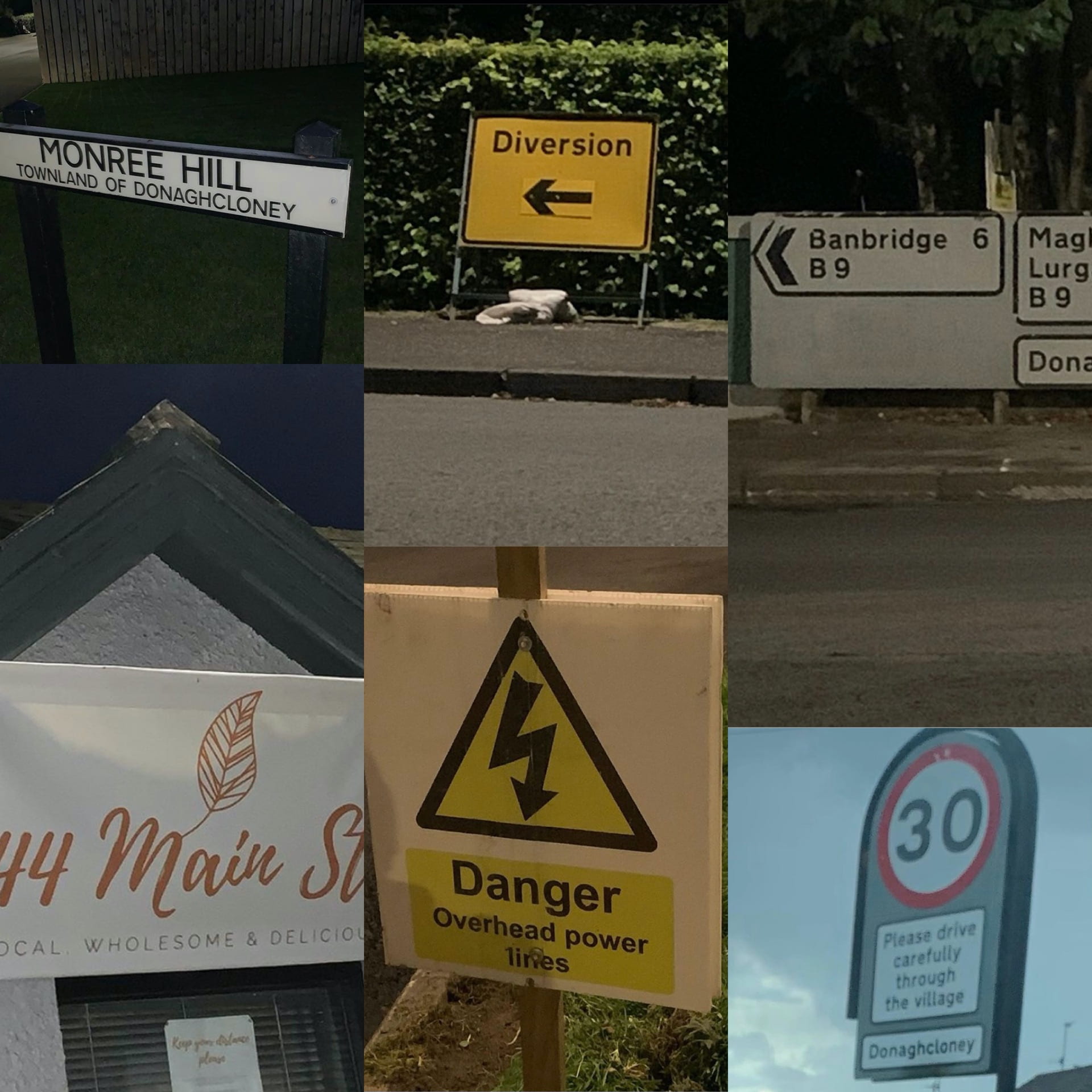
The commercial sign (left, bottom) I chose was a cafe near my house, 44 Main St, which had a nice, inviting style of text to encourage people to go in.

The wayfinding sign (right, top) was a detailed road sign showing various directions in which to go. Using standard typography shows that it is reliable and trusted.

The ad-hoc signs (middle, top and bottom) are temporary diversion and electricity signs. The black and yellow used in both are warnings to people to grab their attention and warn people that certain routes are unavailable, or that there is danger of overhead power lines.

The street sign I chose (left, top) was of a street near where I live. The text is in a trustworthy and simple style, and there is varying size to show where the street is located.

The regulatory sign (right, bottom) I chose was a speed limit sign, warning people to go 30mph. It also shows location, coming into a village. The red around the signs shows that this is a more urgent warning, as something drivers must be aware of, as opposed to standard yellow warning signs.

I was unable to find any graffiti or architectonic signs but will continue to keep an eye out any time I am out of the house.

Week 1: The Letter A on Branding/Books

One of our first tasks was to take time to look around our environment at home and find interesting examples of our chosen letter. My three collages above show the letter A I found on Star Trek books and DVDs, on packaging, and other miscellaneous As.

Two of the Star Trek ones are actually the Starfleet logo, which is called a Delta, but despite this association with the Greek letter (the equivalent, of course, of the Latin alphabet’s letter D), the book which features the first one uses it in place of the letter A in Picard. It fits well and it is immediately clear what the word says, despite a symbol being used in place of a letter.

The packaging As are from Fab ice lollies (top left), Carex hand sanitiser (top right), Alpro soya milk (bottom left), and a Terry’s Chocolate Orange. My favourite of these is the chocolate orange one, as I like the contrast of the dark blue and the orange, and the fact that the A resembles orange peel is very effective advertising.

The other As are from a range of book and video game covers. I really like the first one, as the colour scheme, despite the book’s location being Italy, reminds me of the Swedish flag. I like this collection of images as they show a range of typefaces being used, from sans serif and serif to script typefaces.