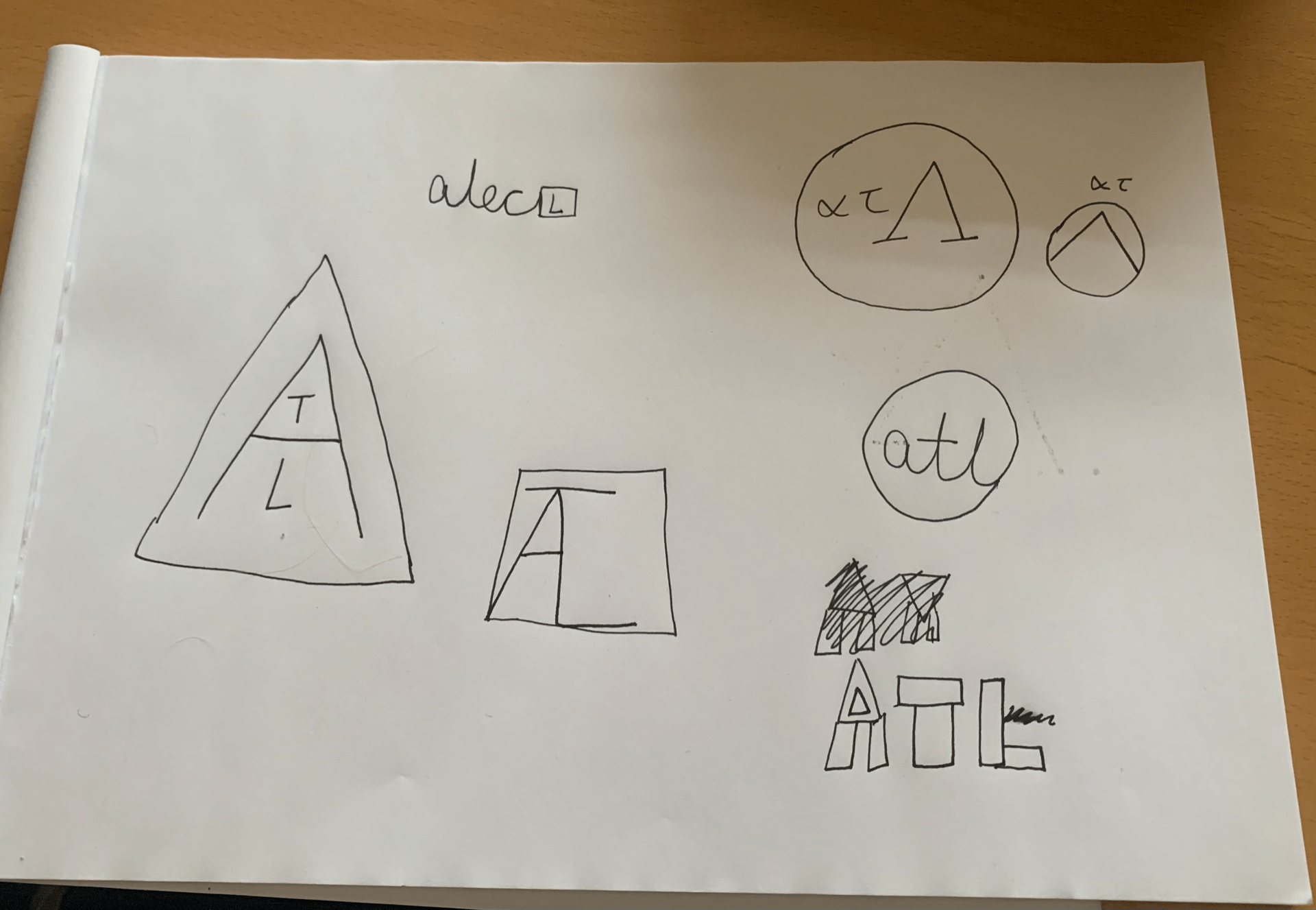
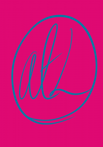
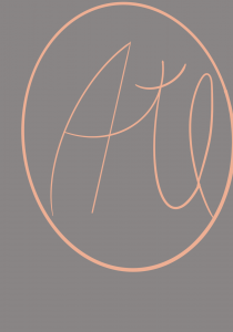


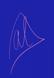

I chose to develop my logo sketches further using Procreate. Some of these are directly based off my sketches, but others are ones I thought of whilst I was doing this task. The top three are my favourites, both due to the shapes used and the colour scheme (the pink/blue one is incredibly vibrant and the contrast is eye-catching).
The first logo uses a lot of contrast as well as the second, and I love how well the colours interact. The third uses very gentle colours and the pink makes me think of ballet shoes, so this logo would be good for a ballet company.
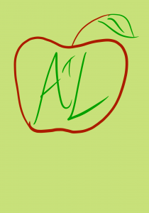
I liked the apple in the fourth one, as I thought it was quite different and was a different interpretation of geometric shapes. I like the way the colours interacted with one another.
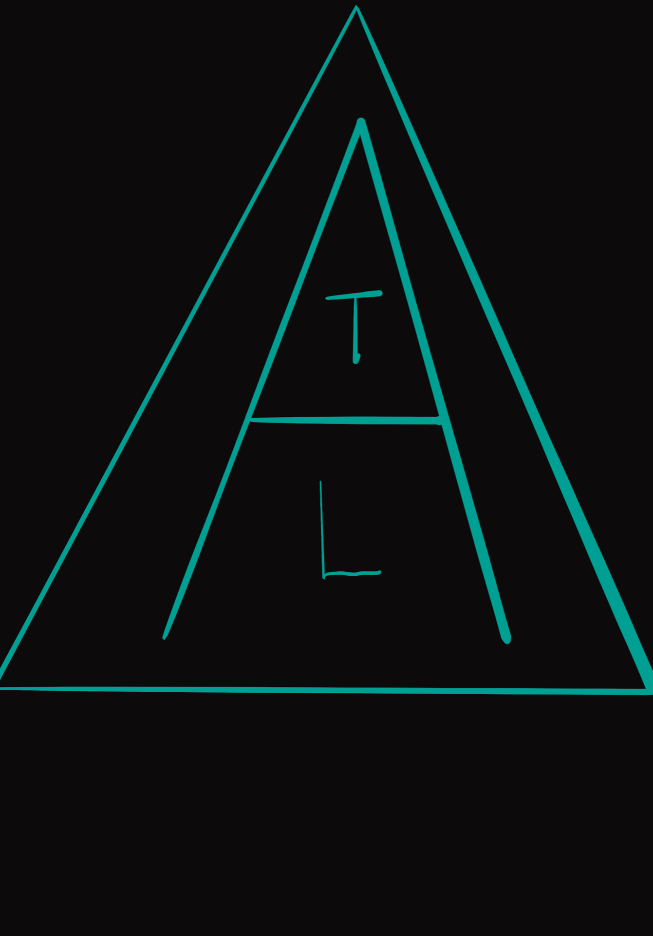
The fifth one has a very bold, vibrant colour scheme which makes it stand out. The letters of my name are stacked within the letter A, which is, in turn, encased in a triangle. I like the neon turquoise on black.
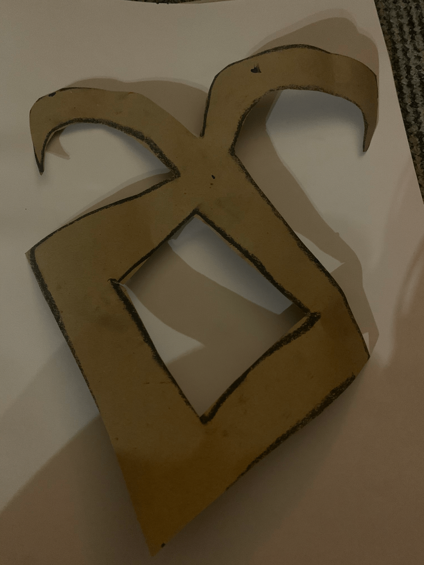
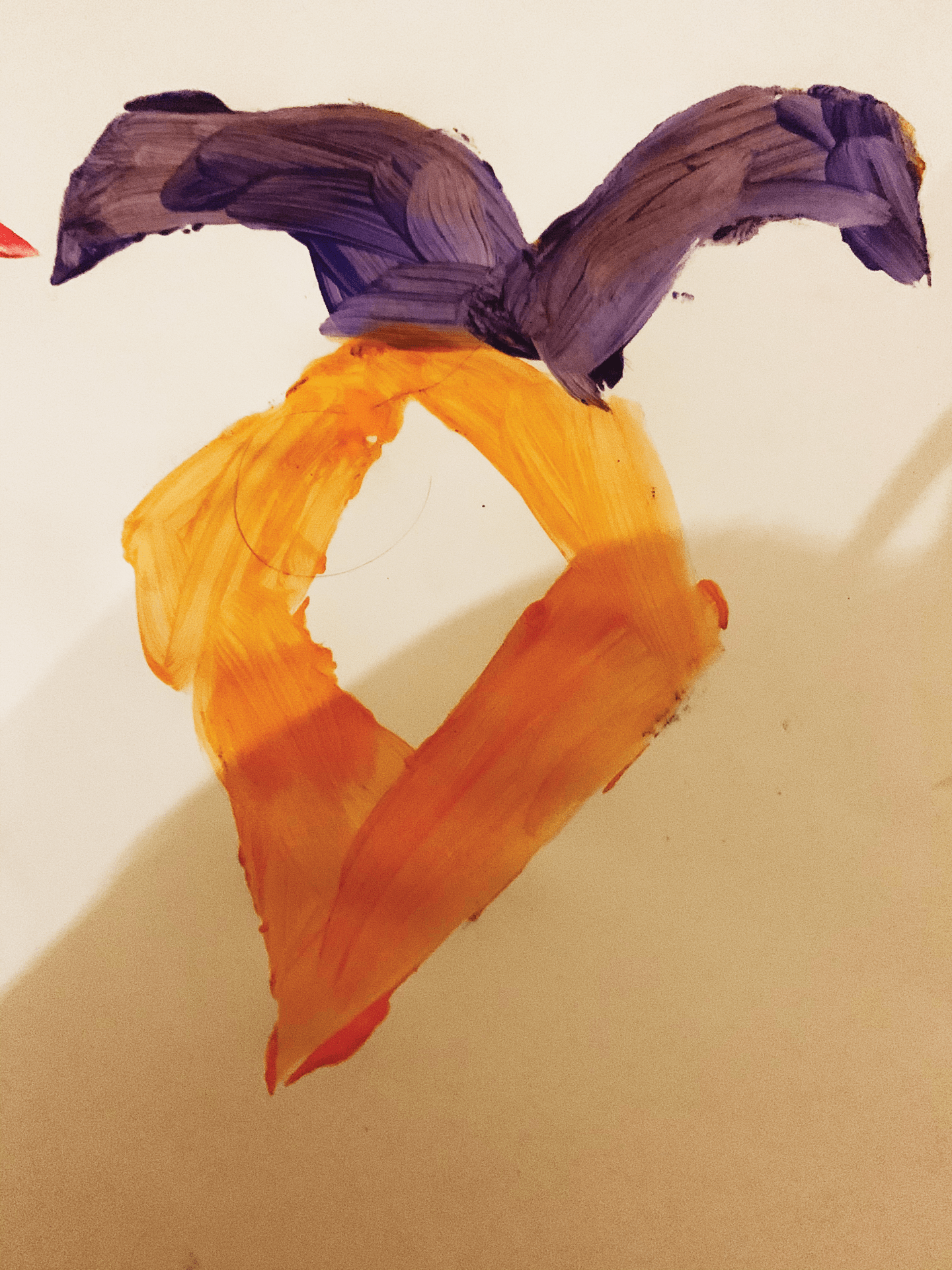
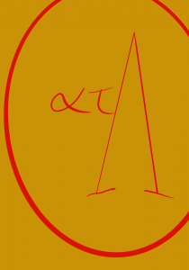
The sixth one was inspired by Sparta, using gold which reminds me of their armour, and red, from the Spartan cloaks worn by soldiers. This is because I was using Greek letters, which, as I have previously mentioned, made me think of a Spartan shield. I really like this one, but the red on gold is perhaps too vibrant.
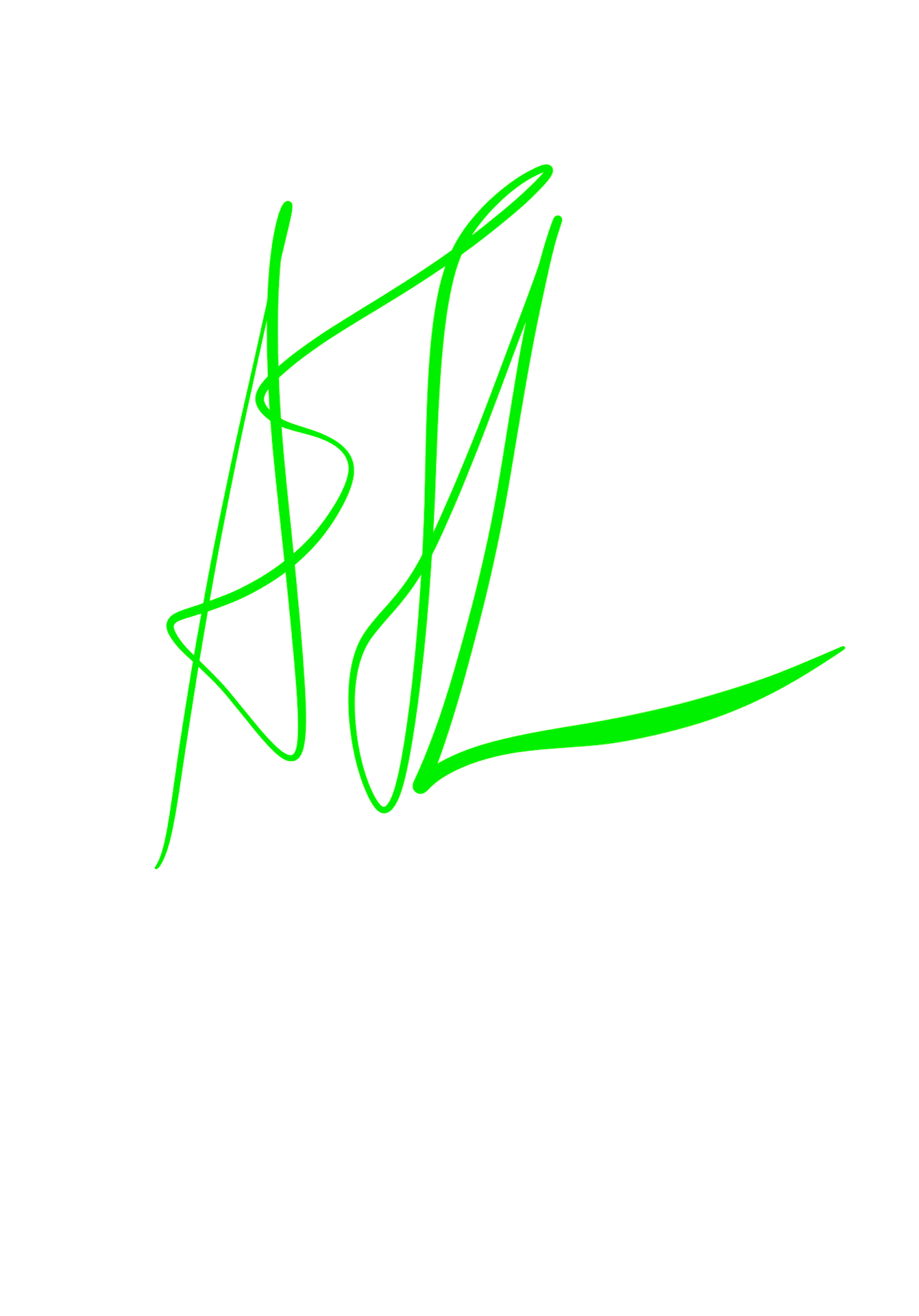
The seventh and eighth ones had nice colour schemes, but I didn’t think they were as successful as the others. The ninth had a good script style, but the neon green didn’t work well on the white background. If I were to re-do this, I would put it on a black background.
Overall, I thoroughly enjoyed this task and would love to do more work like this in the future.
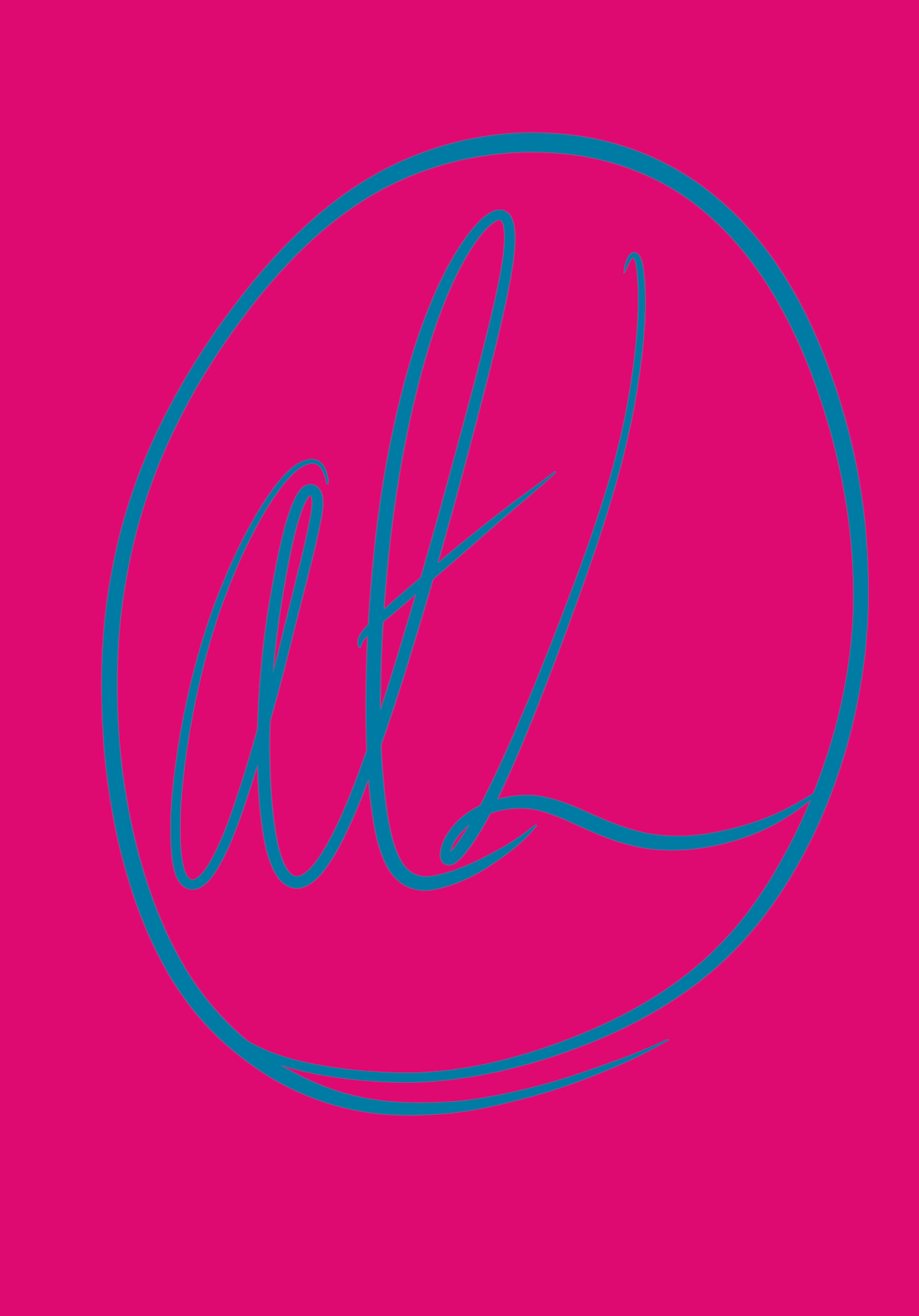
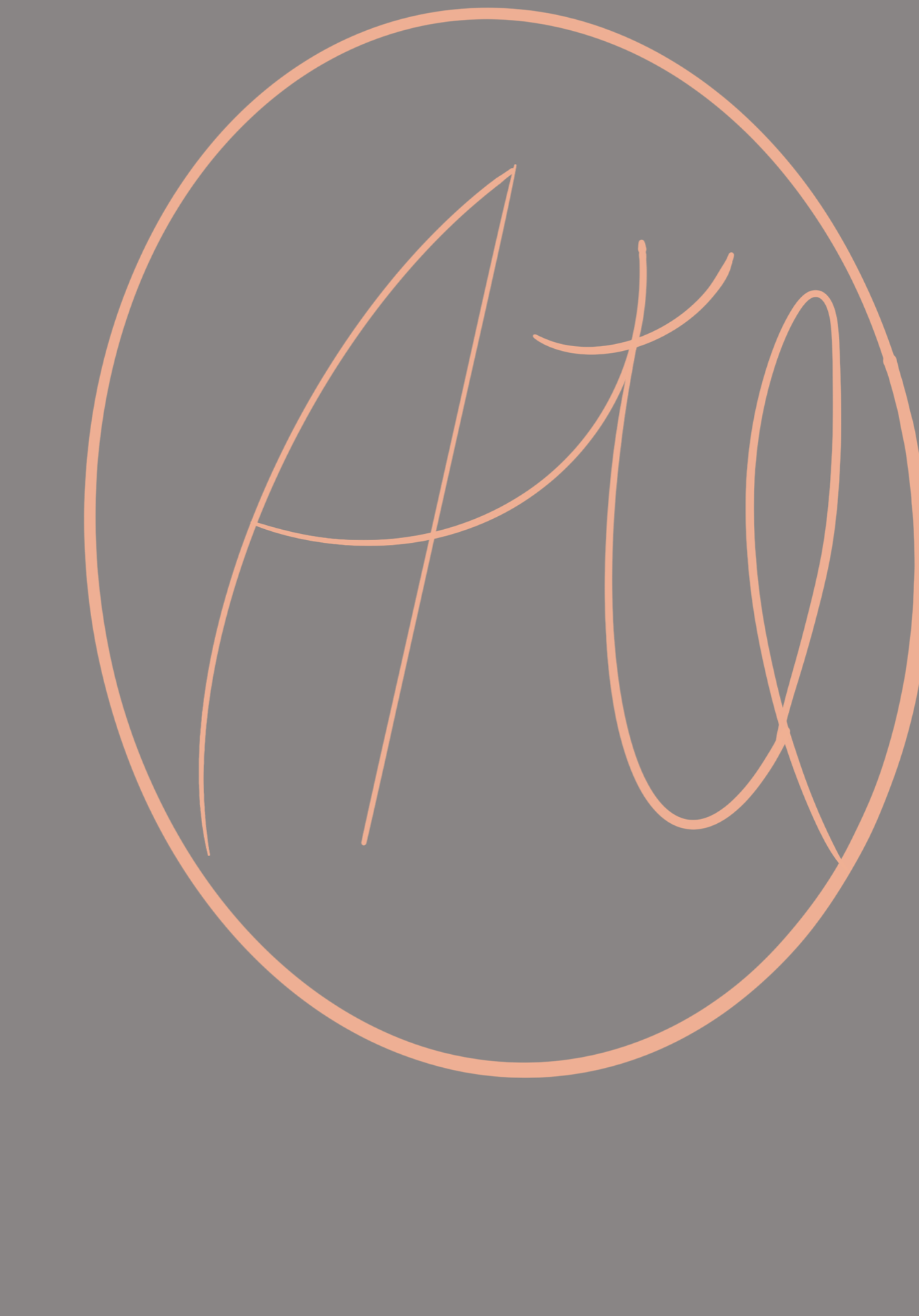
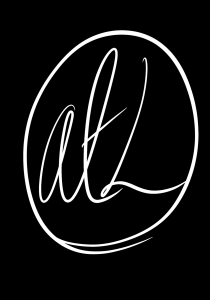
EDIT: I have also included the variations on my logo/wordmark in black on white and white on black. I liked the style of the pink and blue logo so I chose to use this for further development.