Week 3: Inspirational Brand Research (Tasks 1-3)

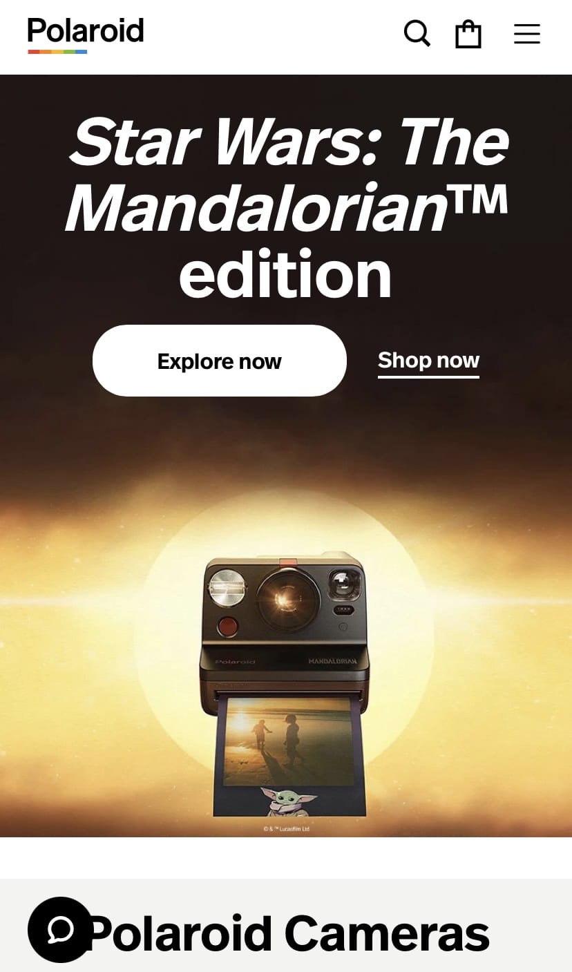
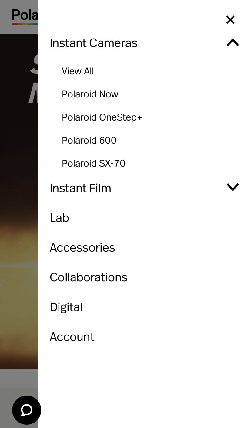
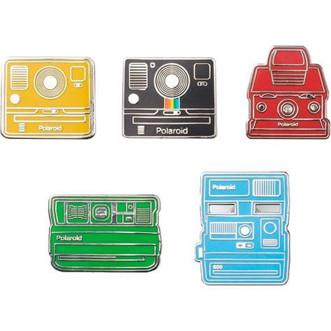
My chosen brand to do quick research into was Polaroid/Polaroid originals. I chose this brand as I believe it to be a very iconic brand, at least in terms of photography. Their logo and brand imagery use a lot of colours but the actual name is in black, and the choice of typeface is simple but reliable, showing its status as a household name. Polaroid is such a well-known brand that other brands of instant-development cameras are often referred to as Polaroids, in the same way that image-manipulation programs are referred to as Photoshop. Polaroid make non-camera products as well, such as apparel and enamel pins, which help to advertise the brand and make it even more well-known. I don’t think that there is an age range, as it is a household brand, but the target audience is for photography enthusiasts, no matter how amateur or professional. They advertise on social media such as Instagram and Twitter, but they also have an email newsletter for those wishing to keep in touch in that way.

If I were to use three words to describe the brand, they would be: iconic, pioneering, and fun, and to describe the target audience in three words, I would use the words: family, photographers, or playful.

Week 2: Music Graphics Task

The piece of music-related graphic design I have chosen is the album cover of the 2014 Off-Broadway (later National Tour and Broadway) musical, The Lightning Thief, based on the 2005 book, ‘Percy Jackson and the Lightning Thief’ by Rick Riordan. The album was released in 2017 for the rebranding and rewriting of the musical, using the same design they had been previously using for the marketing materials and posters. The poster depicts a lightning bolt which has been spray-painted over a blue background. There are white circles spray-painted as well, which seem to resemble clouds, and provide another contrast for the blue and yellow, but also make the title of the musical considerably easier to read, as the text is in the same colour as the background. The title is very easy to read, as it is in what appears to be Arial Bold or a similar typeface, and it is fully capitalised, so it grabs your attention. The limited colour scheme works very well, as it is eye-catching, and the colours interact well with each other. The spray paint may be used to suggest youth, which is appropriate as the musical is aimed at younger audiences (but is suitable for all ages). The lightning bolt design is, as the title suggests, an incredibly important motif, so it works very well as the icon for the poster and materials, as it gives an idea about the theme of the story, as well as looking very interesting. It is a contemporary design and definitely gives off a modern impression, and the CDs and vinyl records stand out because of this intriguing cover design. The design is simple but recognisable to fans of Broadway musicals, as many musicals prefer to use a basic or minimalist approach to their posters or marketing materials.


(300 words)


Week 2: Using Adobe Illustrator to make the Alphabet

Our digital task this week was to create shapes using Adobe Illustrator, after doing various tutorials using Photoshop and Illustrator. Once we were confident in this, we were given the task of creating the alphabet using these shapes, trying not to skew or distort the shapes too much, to keep the letters looking almost geometric, and to give it our own style. I enjoyed this task a lot, as I am confident using Adobe Illustrator, so I worked with each letter carefully, seeing what would look best and scrapping it if it did not resemble the letter closely enough. My favourite letters are the D, M, and Z, as I felt that they looked very interesting, but I am happy with how they all turned out. I also did numbers 1-10, and I think that the number 5 is very sleek, but I like the way the 8 turned out, as I did a lot of replicating shapes and rearranging them to get it to look the way it did.

Overall, I enjoyed this task and look forward to working in Illustrator in the future.

Week 2: Postcards based on Collage Work

For this task, we had to create a large collage or series of collages to be made into smaller (158x227mm) postcards. The first image below shows the collage I had made, in A3 size, to crop and edit into the postcards on the computer using Adobe Illustrator. I moved the crop area around for each postcard to highlight a different area of the overall collage, which had the theme, ‘food and fine dining’. I really liked the way different foods and words to do with eating overlap, as I think this worked well as a theme. My favourite postcard is either the first or the last one, as I feel like the model in the photograph provided a good focal point for the postcards.

Week 1: Stencil Work

Our next task was to make stencils out of card or cardboard, and to use them with art supplies to create our letter on paper or other materials. I did the rune design again but chose to do it the right way up, but the design could always be turned on its side to resemble the Alpha I had done before. I drew the rune with black soft pastel as it was quite dark and noticeable on the brown card, and began to cut it out. Once I had done that, I chose a few different media to use. I went for paint splattering for one, painting the design for another, and drawing the outline using soft pastel for the last. As I am not yet too confident with stencil work, I think my first attempt was okay, but if I were to attempt this in the future, I might choose a different medium or use cardboard instead of card, as the card was quite light and flimsy.

Week 1: Typography in Signage

We had a task to go out and photograph examples of signs in our local environment. Our categories, from which we had to try and take at least one relevant photograph, were:

-Shop/commercial signs

-Wayfinding/directional signs

-Ad-hoc signs/posters/stickers, etc.

-Street signs

-Regulatory signs

-Architectonic (architectural) signs

-Graffiti, tags, murals, stc.

The commercial sign (left, bottom) I chose was a cafe near my house, 44 Main St, which had a nice, inviting style of text to encourage people to go in.

The wayfinding sign (right, top) was a detailed road sign showing various directions in which to go. Using standard typography shows that it is reliable and trusted.

The ad-hoc signs (middle, top and bottom) are temporary diversion and electricity signs. The black and yellow used in both are warnings to people to grab their attention and warn people that certain routes are unavailable, or that there is danger of overhead power lines.

The street sign I chose (left, top) was of a street near where I live. The text is in a trustworthy and simple style, and there is varying size to show where the street is located.

The regulatory sign (right, bottom) I chose was a speed limit sign, warning people to go 30mph. It also shows location, coming into a village. The red around the signs shows that this is a more urgent warning, as something drivers must be aware of, as opposed to standard yellow warning signs.

I was unable to find any graffiti or architectonic signs but will continue to keep an eye out any time I am out of the house.

Week 1: The Letter A on Branding/Books

One of our first tasks was to take time to look around our environment at home and find interesting examples of our chosen letter. My three collages above show the letter A I found on Star Trek books and DVDs, on packaging, and other miscellaneous As.

Two of the Star Trek ones are actually the Starfleet logo, which is called a Delta, but despite this association with the Greek letter (the equivalent, of course, of the Latin alphabet’s letter D), the book which features the first one uses it in place of the letter A in Picard. It fits well and it is immediately clear what the word says, despite a symbol being used in place of a letter.

The packaging As are from Fab ice lollies (top left), Carex hand sanitiser (top right), Alpro soya milk (bottom left), and a Terry’s Chocolate Orange. My favourite of these is the chocolate orange one, as I like the contrast of the dark blue and the orange, and the fact that the A resembles orange peel is very effective advertising.

The other As are from a range of book and video game covers. I really like the first one, as the colour scheme, despite the book’s location being Italy, reminds me of the Swedish flag. I like this collection of images as they show a range of typefaces being used, from sans serif and serif to script typefaces.

Week 1: 3D Letter A

We were tasked with creating a 3D version of the letter we had drawn. I began to see the problem with choosing such an elaborate shape, as I knew I would have difficulty in creating this out of cardboard, which was my chosen medium. However, I took the challenge and began to create this. I started by drawing the shape on two sheets of cardboard, making tabs for folding as I went along, and then I cut it out. It took a while to assemble using masking tape, but I eventually finished and moved on to decorating it. I chose to use tin foil as I felt that if I painted it, the heavy layers of tape would still be visible, so I wanted something which would both cover the letter and create an effective finish. I believe I achieved this successfully, and whilst I had difficulty in creating this piece, I am happy with the end result.

Week 1: Chosen letter in more detail

For our next task, we were told to choose one of the letters we had drawn, and to draw it again, in more detail. I chose to draw one I had based off a rune. The rune is called Enkeli, or the Angelic Power rune, from the Mortal Instruments book series by Cassandra Clare, and I had noticed that placing the rune on its side made it almost resemble the Greek letter alpha (α), so I chose this letter to draw as I liked that it had a bit more background information, and was simple yet effective as my chosen letter. These have been drawn in charcoal, pencil, fine drawing pen, and pro marker (with an outline in fine pen). I had a lot of fun drawing these, as runes are very interesting for me to draw.