Week 1: The Letter A on Branding/Books

One of our first tasks was to take time to look around our environment at home and find interesting examples of our chosen letter. My three collages above show the letter A I found on Star Trek books and DVDs, on packaging, and other miscellaneous As.
Two of the Star Trek ones are actually the Starfleet logo, which is called a Delta, but despite this association with the Greek letter (the equivalent, of course, of the Latin alphabet’s letter D), the book which features the first one uses it in place of the letter A in Picard. It fits well and it is immediately clear what the word says, despite a symbol being used in place of a letter.
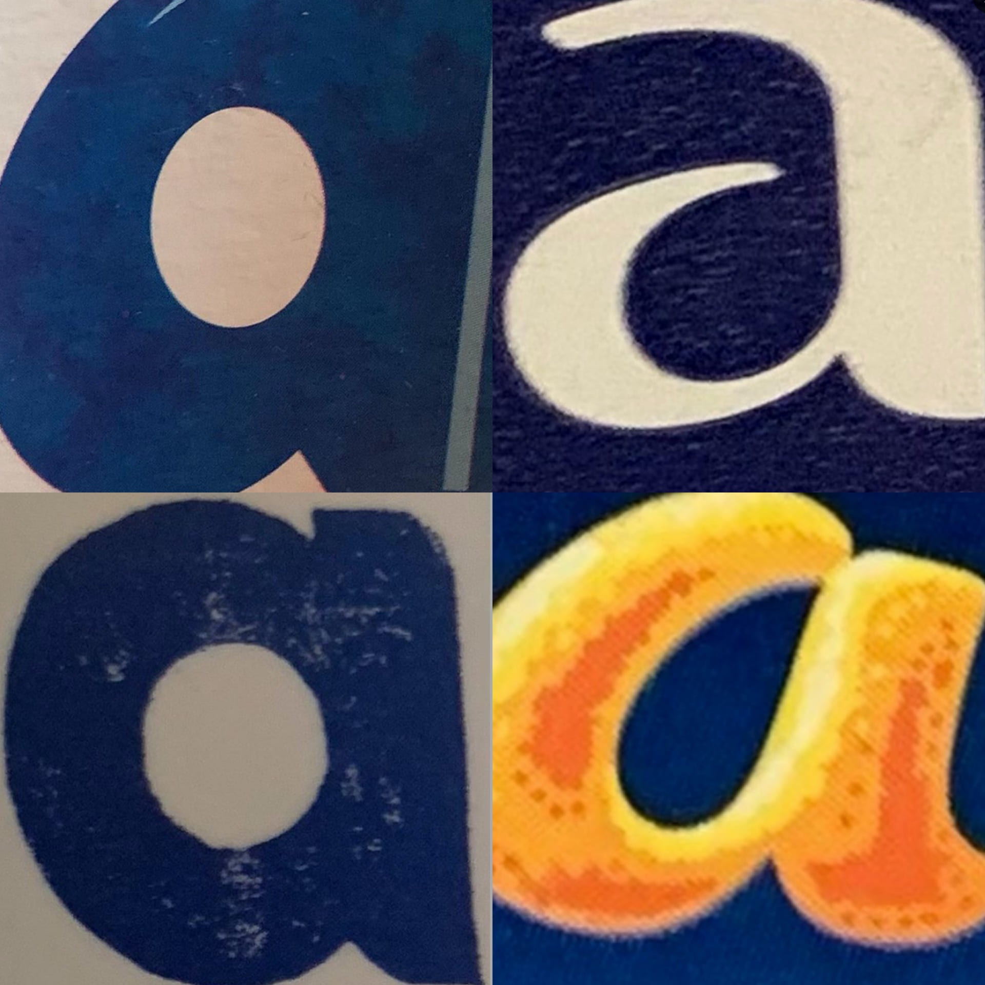
The packaging As are from Fab ice lollies (top left), Carex hand sanitiser (top right), Alpro soya milk (bottom left), and a Terry’s Chocolate Orange. My favourite of these is the chocolate orange one, as I like the contrast of the dark blue and the orange, and the fact that the A resembles orange peel is very effective advertising.
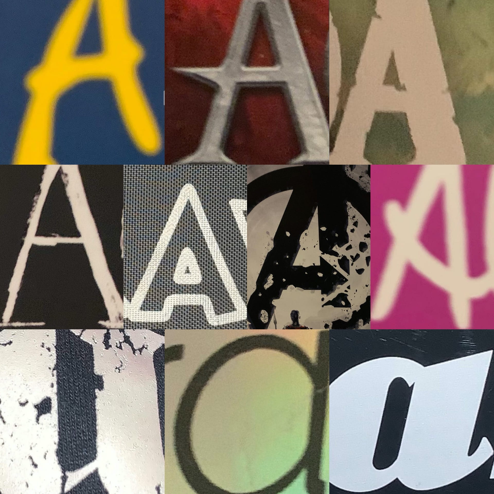
The other As are from a range of book and video game covers. I really like the first one, as the colour scheme, despite the book’s location being Italy, reminds me of the Swedish flag. I like this collection of images as they show a range of typefaces being used, from sans serif and serif to script typefaces.