Exhibition Catalogue Updated_compressed


Exhibition Catalogue Updated_compressed
For our Second task in graphic design, we had to pick some famous classic, paintings and recreate them as photographs.
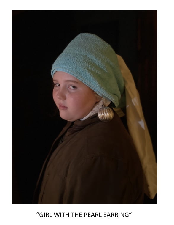
I decided to first attempt recreating one of my favourite pieces of art, Girl with a Pearl Earring an oil painting by Dutch Painter, Johannes Vermeer, dated c. 1665.
it depicts a woman of unknown origin, many speculate that the artist had painted a portrait of his mother, and that she is the one portrayed in the piece, however this has never been proven or disproven.

“
The second photo I attempted didn’t come out just as polished as the first, however I still believe it achieved the intentions I had for it. Not to Be Reproduced is a painting by the Belgian surrealist René Magritte. I chose to do this as my remake as I thought it would be a good chance to try out the panorama effect on my phones camera as I could get my subject to turn around and enable me to create the surreal effect portrayed in the picture.
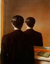

I also chose to recreate “Not to be Reproduced” as i thought the irony of me technically ‘reproducing’ it, as it proved more difficult to get right so maybe it was better left not to be reproduced.
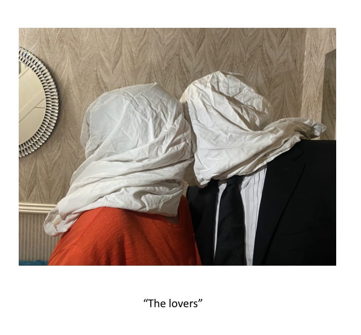
The last painting I decided to recreate “the lovers” by Rene Magitte, an oil painting made in 1928, it depicts two lovers in an embrace with a barrier of fabric separating them, the painting really spoke to me as I thought it was an exceptional piece of art, very abstract and got me thinking. I covered my 2 subjects faces in pillow cases and got them to dress up in a similar fashion as the people in the painting.

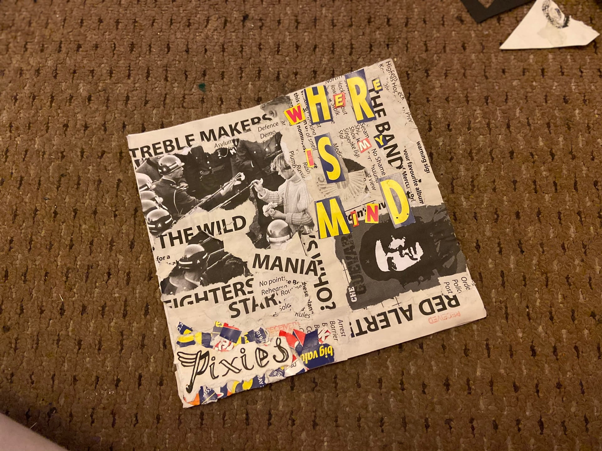


I began my album cover with thinking about how I wanted to present it. I decided I wanted to go with the ripped up homemade style that other punk artists have utilised in the past. I found a word search book that worked perfect for my idea, I wanted it to look like ripped up newspaper articles and the titles of the word searches were mostly relevant to the situations I was trying to create. For instance I found titles such as “Britain’s favourite”, “red alert” “shady business” and others that made it seem like they might have been from articles about the band.

I then started to print old influential photos that I thought might be relevant, for example a group of punk rockers in a pub in the 70s is on the back of the cover.
i then cut out some letters from the cover of the word search and created a ‘random font’ style title for the song “where is my mind” by the Pixies.
after that I created some paintings of the logo, band title and album name for the front and back of the cover in the same colour scheme as the ransom font at the front.
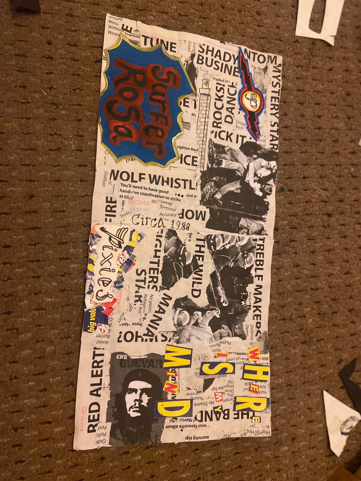
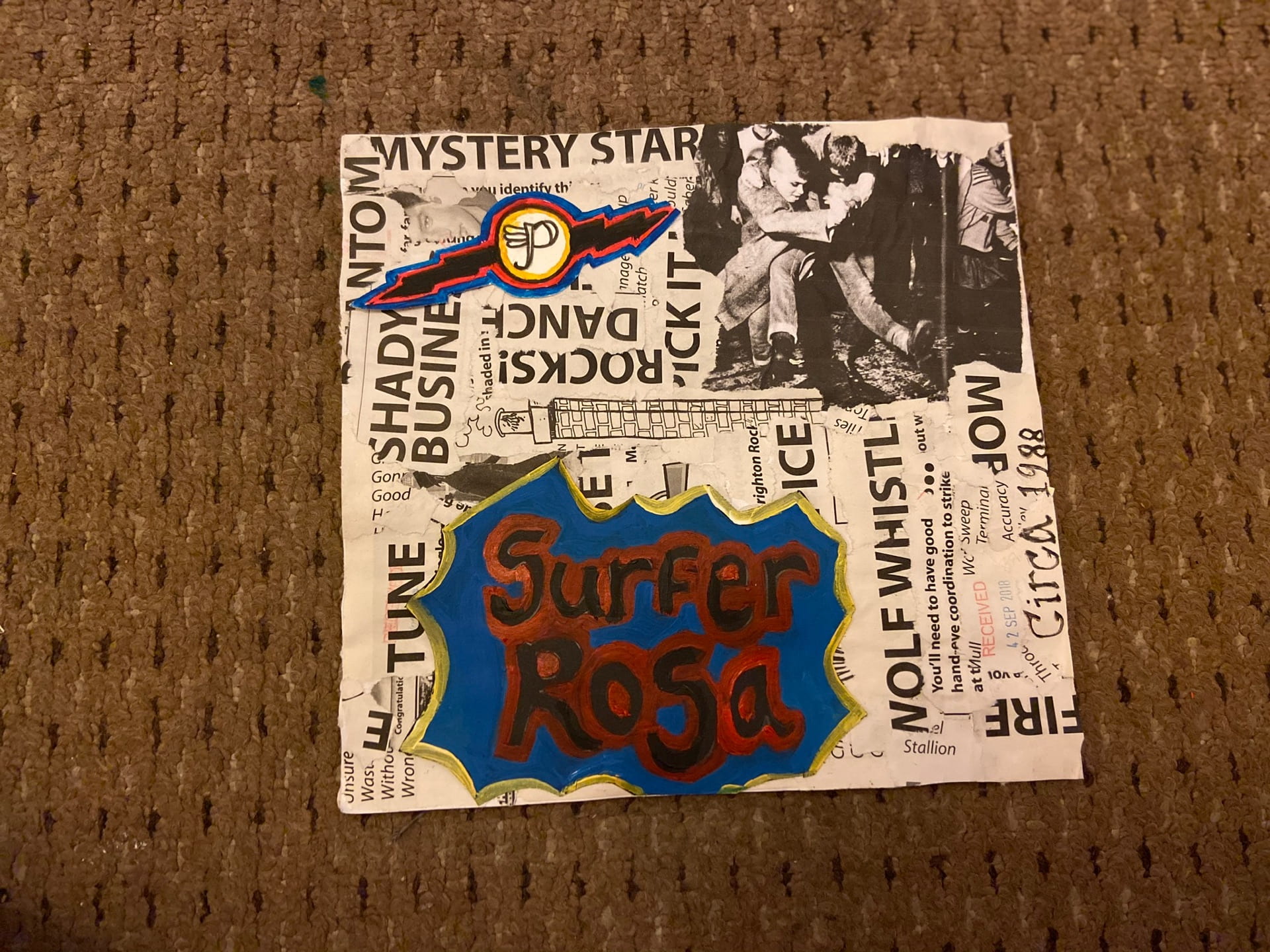
i am happy with the outcome of my work I think it works well as a album cover and I finished up with the creation I wanted in the beginning.
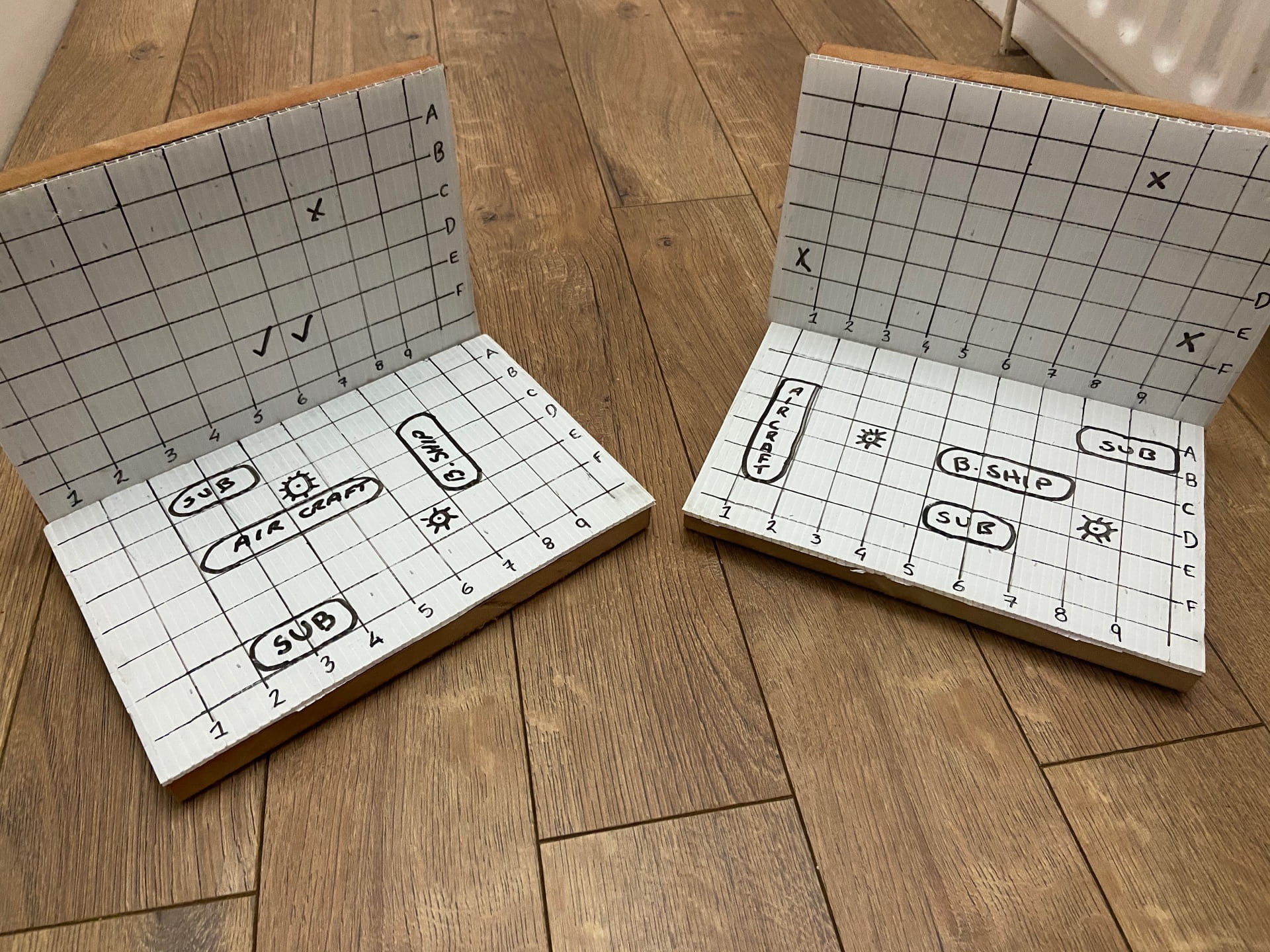
Our task for gaming was to rethink the classic game “Battleship”, by adding, changing or removing: rules, objectives and tasks.
I found this difficult at first, as I had never played the game, and had to seek Guidance from YouTube and family members more familiar with it.
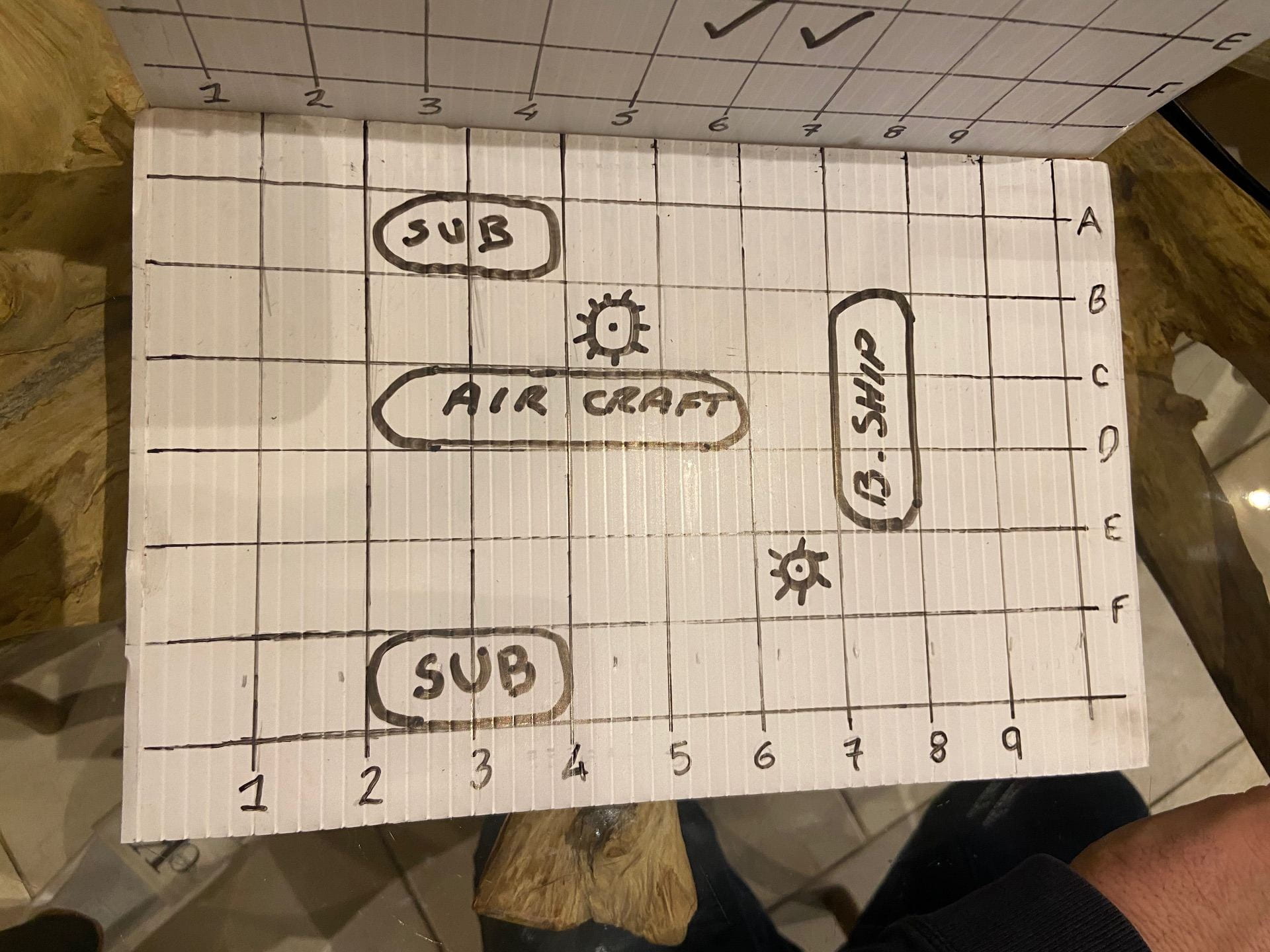
i decided to change the concept of using Play pieces I.E the battleships and submarines, that can get lost and misplaced, and instead use a plastic material, that would be able to take dry wipe markers, to enable the player to draw their own ships etc onto the board, and wipe them out as they are hit, as well as logging the already played co-ordinates. This makes the game more environmentally friendly as it takes less materials to create it and less small pieces that will be lost and most likely not recycled to sit in landfill for many years in the future.
i also decided to add an element into the game; I chose to add sea mines that the player can draw onto their own board, if the opposing player hits the co-ordinates with the sea mine, they miss their next turn, if the same player hits a second sea-mine, they sink one of their own ships (the smallest one they still have) .
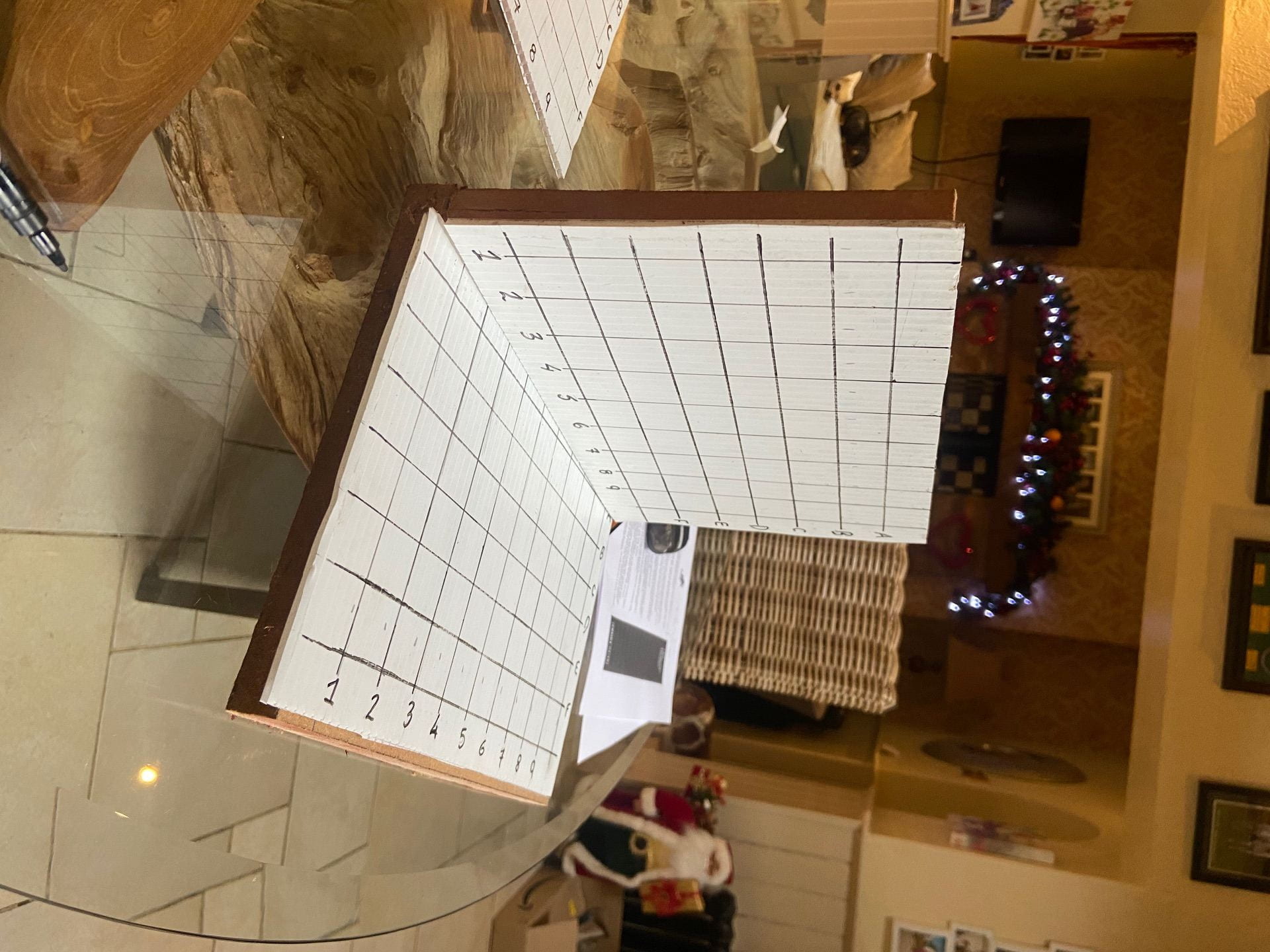
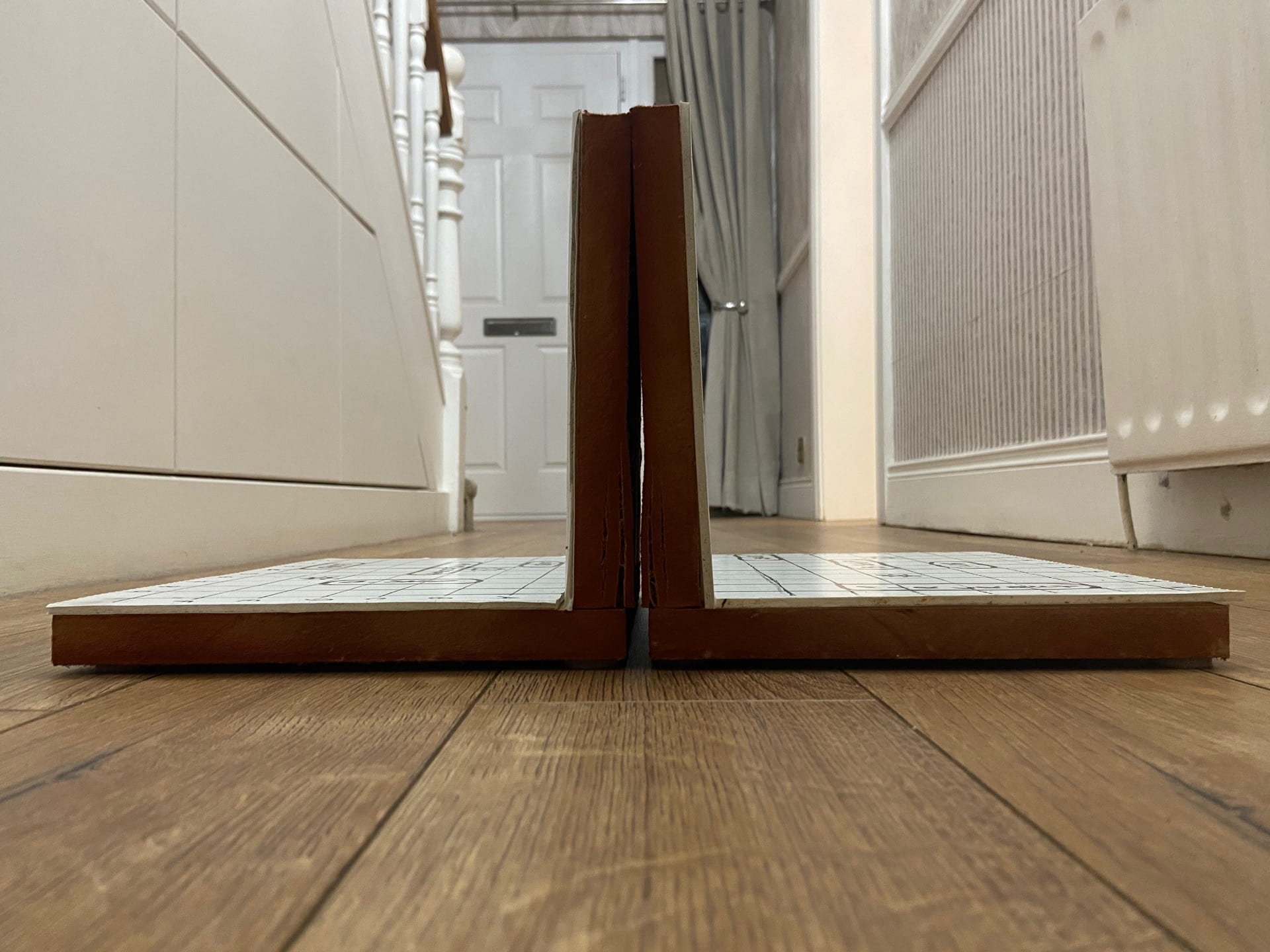
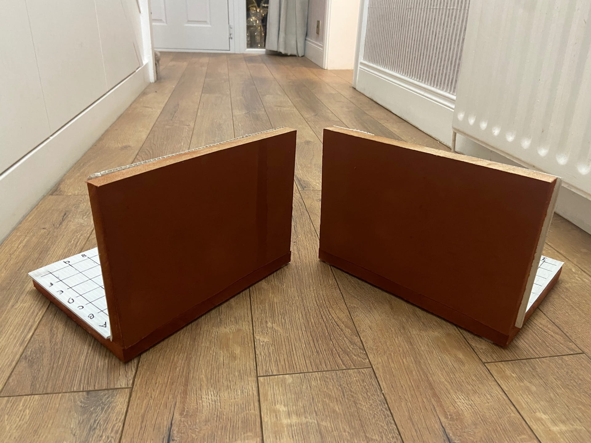
i started making the board out of wood and a plastic sheet, I attached the pieces of wood together and Begab drawing the grid onto the plastic.
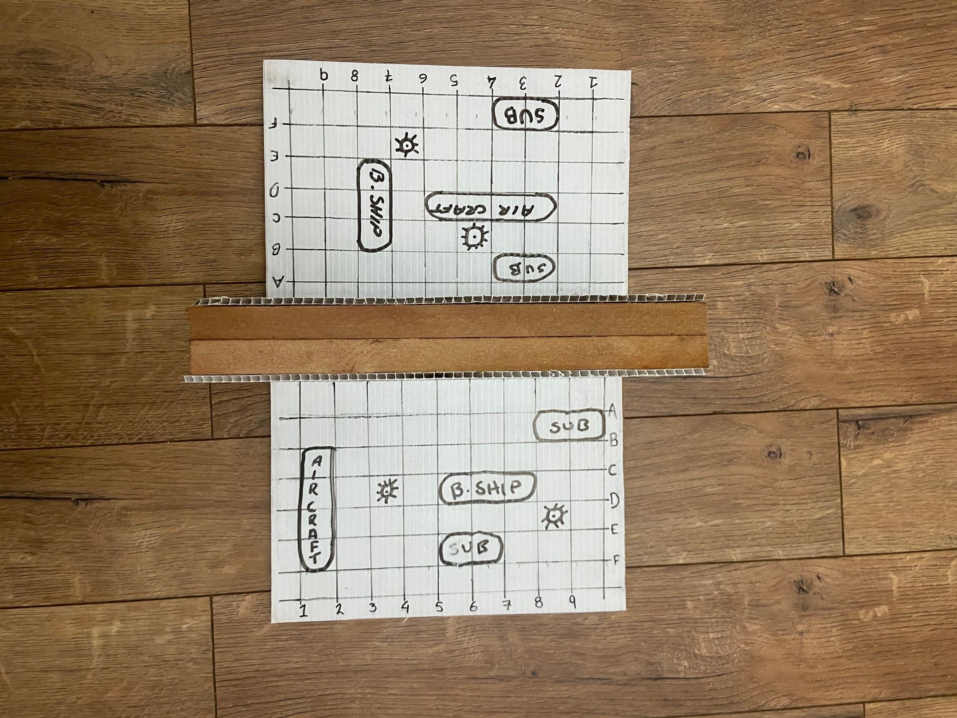
I then set out to put the game into action.
I took several photos of how the game would look when it is fully set up.


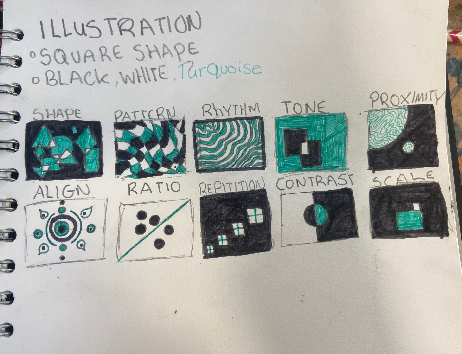
Our first task for Illustration was to create drawings relative to 26 words for example: Ratio, Scale, Align.
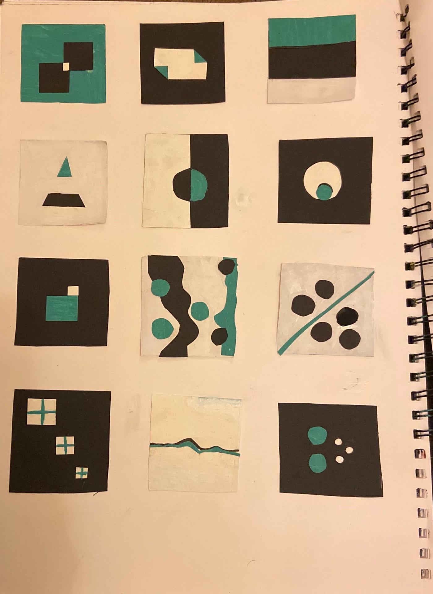
we were asked first to create 10 sketches of the first 10 words, I chose the colour scheme of clack white and turquoise.
I decided that I would continue sketching the rest of the icons, however there were a few that I could not think of.
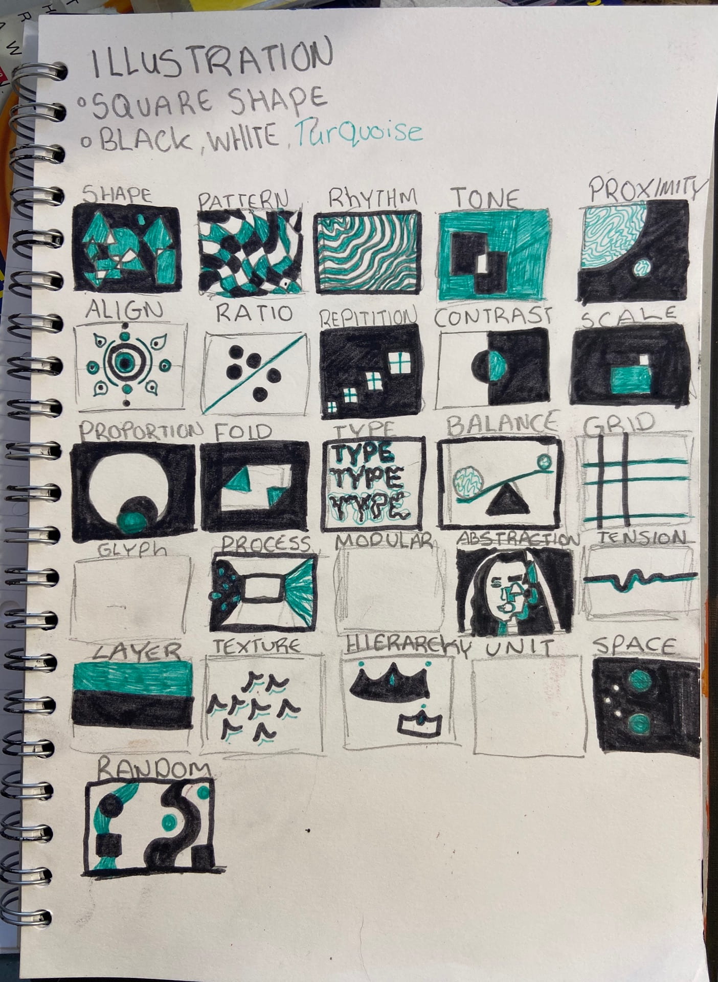
I was unable to create virtual Versions of my illustrations as I did not have access to a laptop or computer, instead I created a series of 24 paintings in the same colour scheme as my previous quick sketches.
I am happy with my outcome and through to my process of creating them I decided to incorporate a colour scheme into my work in the future as I think it ties the work together and gives it a nicer overall look. The project also changed my perception of what illustration was.
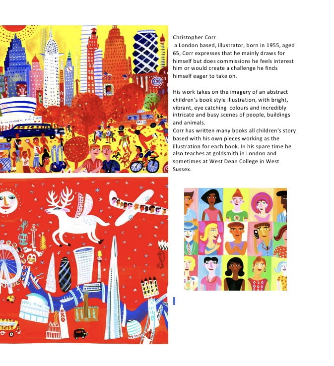
to investigate illustration as a career and a course I did some research into illustrators

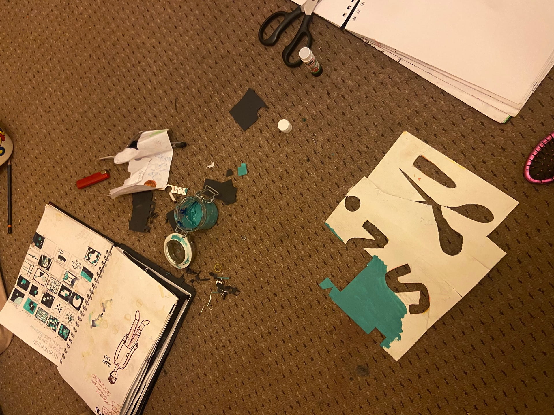
we also had to create a number of cutout, paper versions of our illustrations. I continued my colour scheme and used scraps of old, recycled paper to reduce my waste in my work.
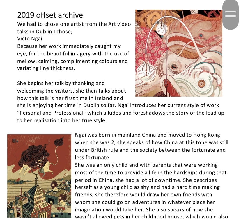
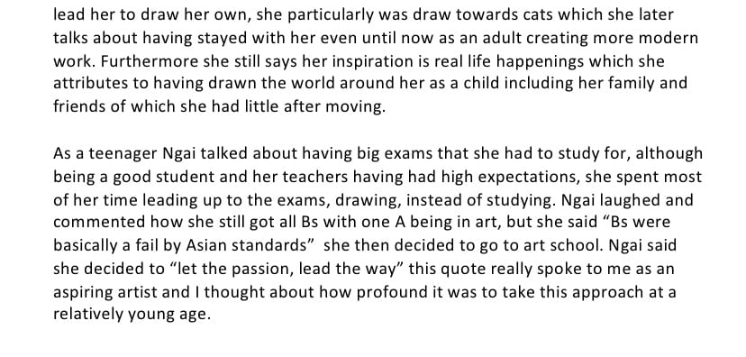
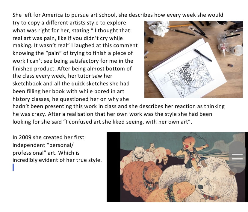
I also watched the offset archive video talks in Dublin in 2019 , I chose illustrator ‘Victo Ngai’.
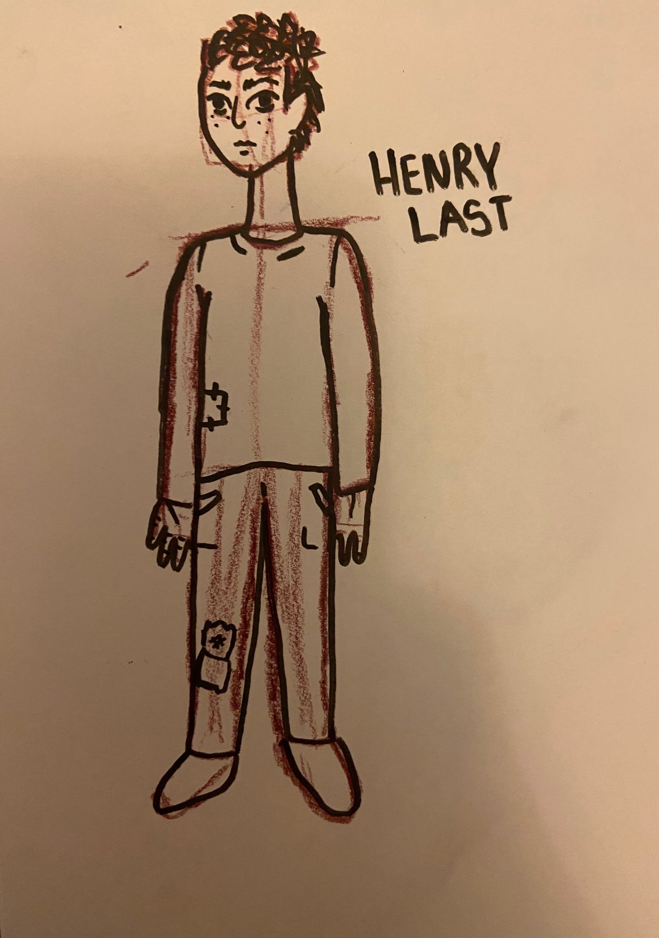
for our animation design workshop we were asked to create a character and story, what their world is like, their personality traits, their clothing et.c
i began brainstorming some ideas 
I thought of an interesting concept.
the last man on earth, in a desperate attempt to stay sane, try’s to carry out his daily routine I.e. having a shower, going to the shops, going to work, stopping at red lights and stop signs; despite being totally alone.
I decided to make him look slightly vulnerable, with a baby face and ratty clothes to imply he is starting to run out of supplies as production of everything has been halted as he is the last on earth. I did this so that the viewer would feel empathy towards him.
I want the scene to be set in a desolate city with cars crashed into light posts and papers floating around, like the beginning of a zombie apocalypse movie only no zombies.
Animation task:
we were shown how to create a small stop motion video of objects moving, by drawing straight and curvy lines with small indications of how far along to move the objects along the line, we ended up with a finished product of the objects moving back and forth across the pages. We also experimented where we put the indications of where to move the objects and what shape the line could be, this greatly changed the speed and direction of the objects when the final video is created.
these are the videos of my experimentals.
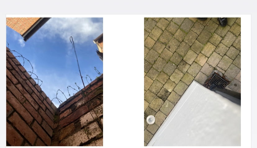
We were assigned to create a series of photographs that relate to each other, while also creating an interesting and unique composition.
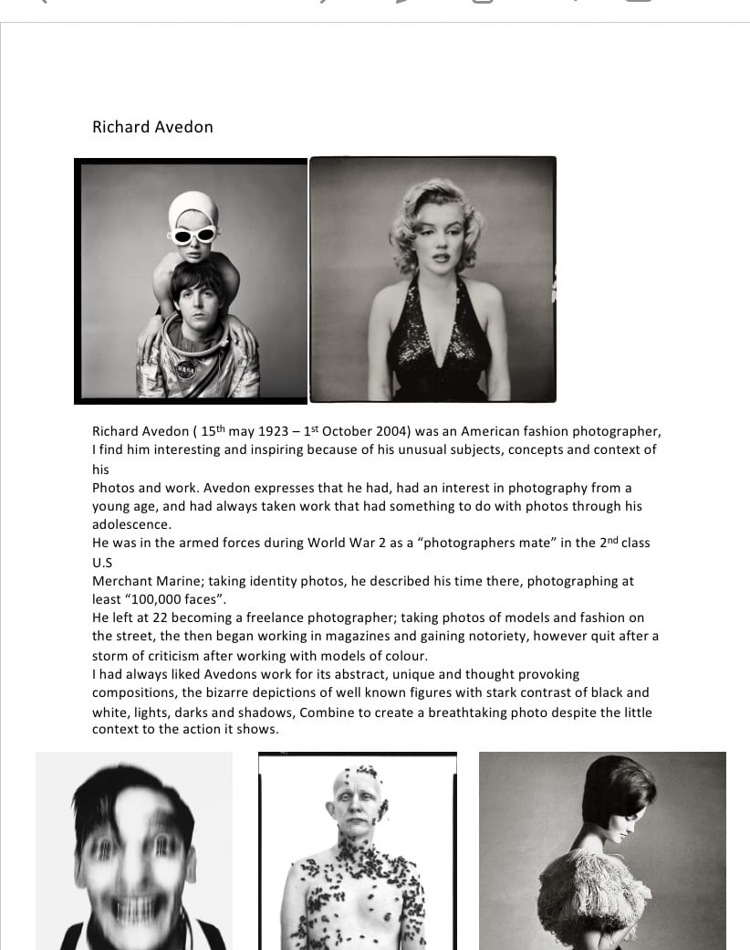
we were also asked to conduct some research into a photographer that we find inspiring, I chose Richard Avedon


For our interaction design project we had to create something that would help people take time away from their devices and enjoy the world around us I.E nature.
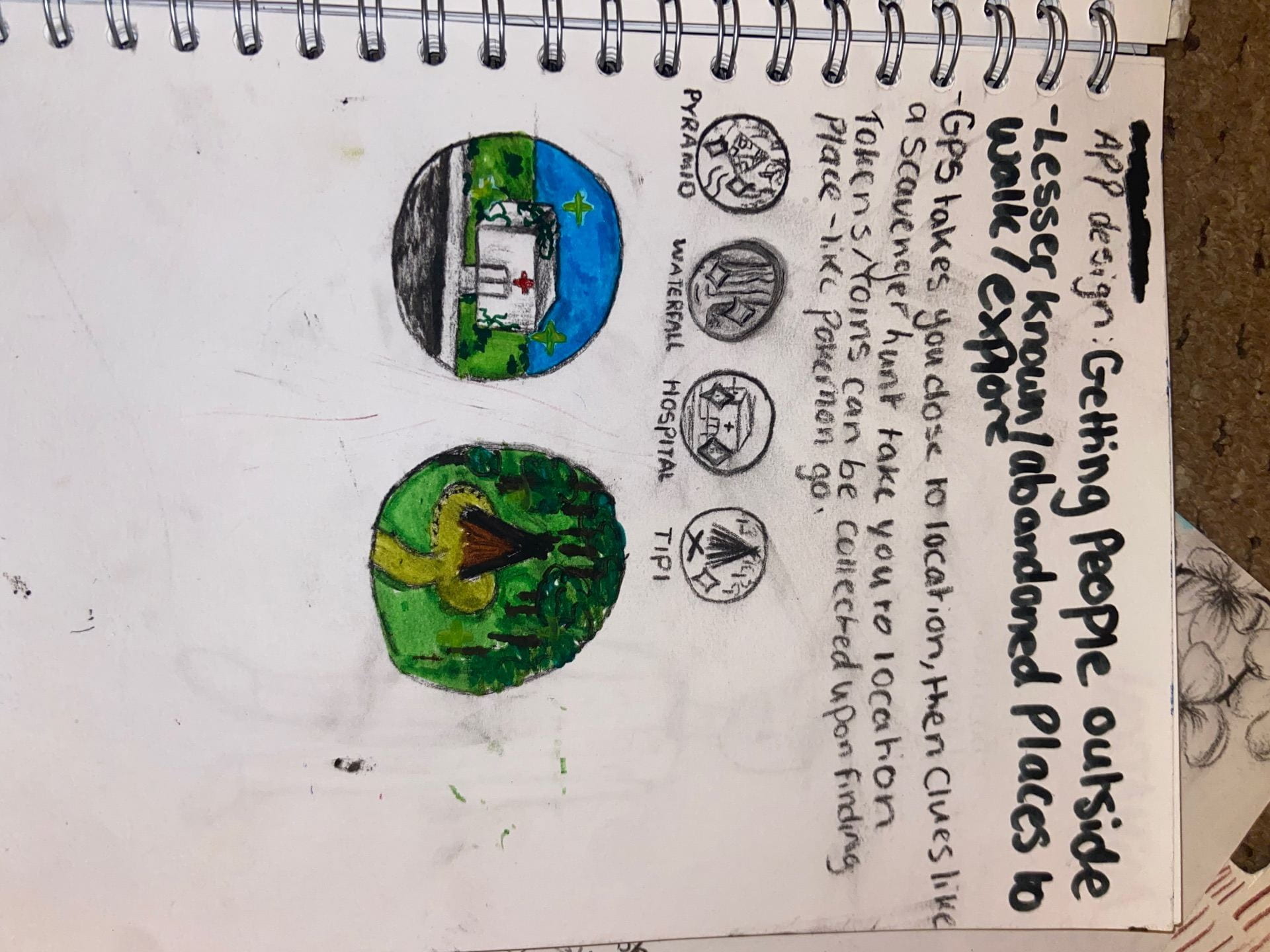
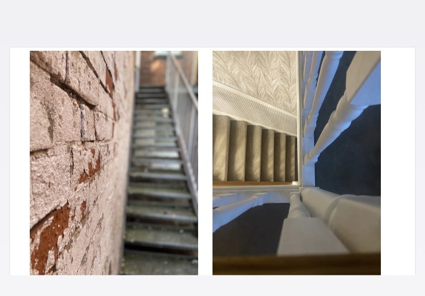
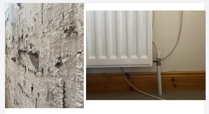
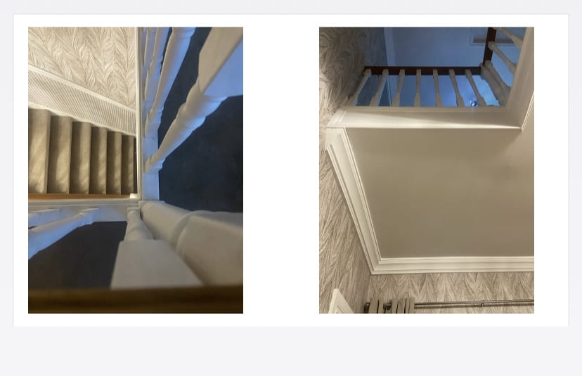
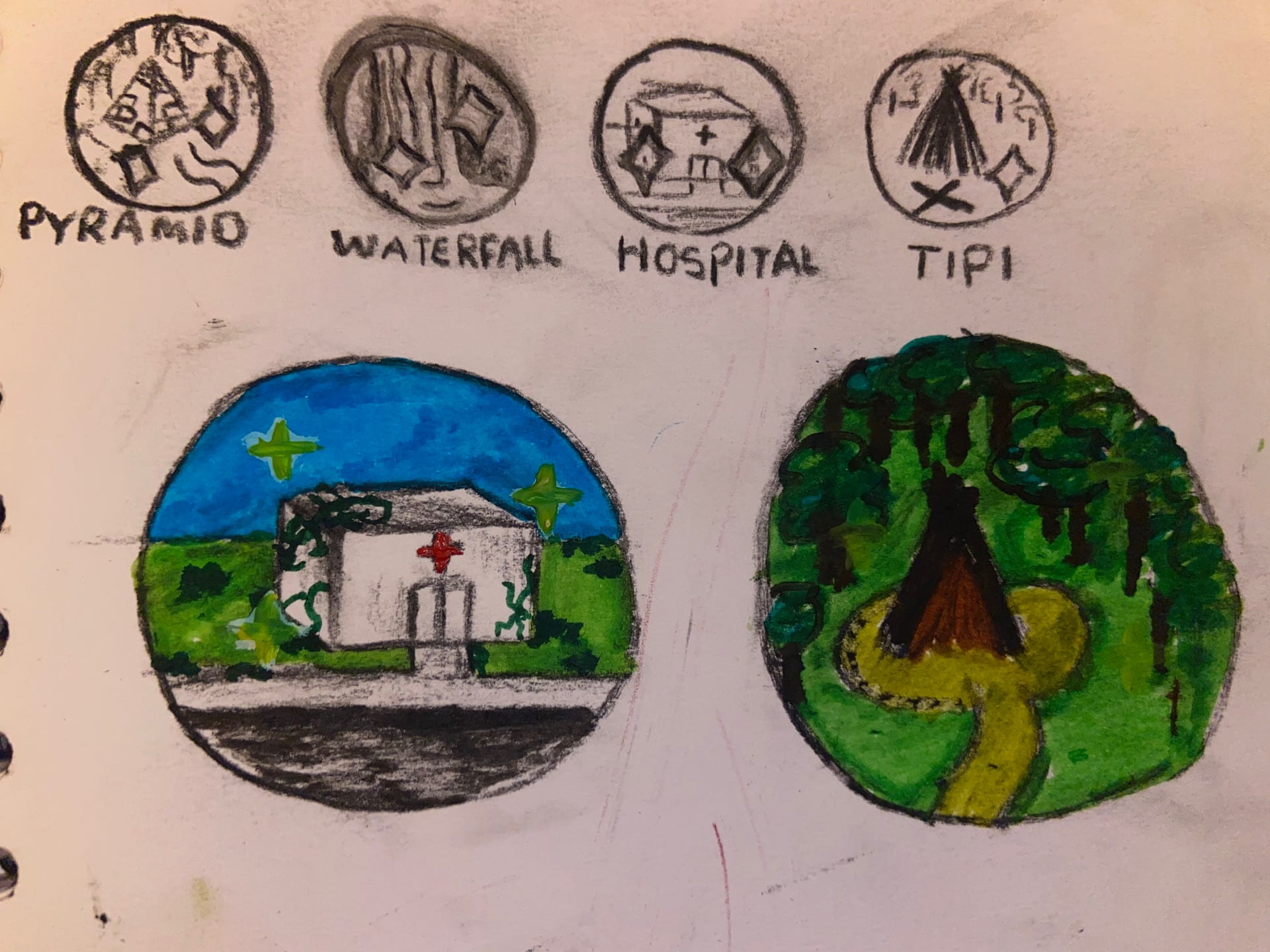
i decided to create an app (inspired by Pokemon go and geocaching), in an almost scavenger hunt like style. The app would help people get out of their house and into nature, through finding lesser known/ abandoned sites, places and nature walks et.c, by showing the user an icon, which shows a small graphic or cartoon of the secret location these are some examples.
the user would then click on the icon and they would be shown a map/ gps to the location; when they get close to the location, they will be given a list of clues in order to fully find the unknown/ abandoned place.
once there the app Will verify their location and the icon they clicked at the beginning of their journey will “unlock” and become colourised, it will also go into their inventory in the app, the user will have all their “tokens” or “icons” available to look through and revisit. When the icon unlocks the user will be able to write a small paragraph or comment about the place for others who have found it can see.
i chose to design this app as I have always had an affinity to abandoned places and buildings as I believe they all have such rich history, and I enjoy envisioning the bustling life that would have inhabited these places before they were left to rot.
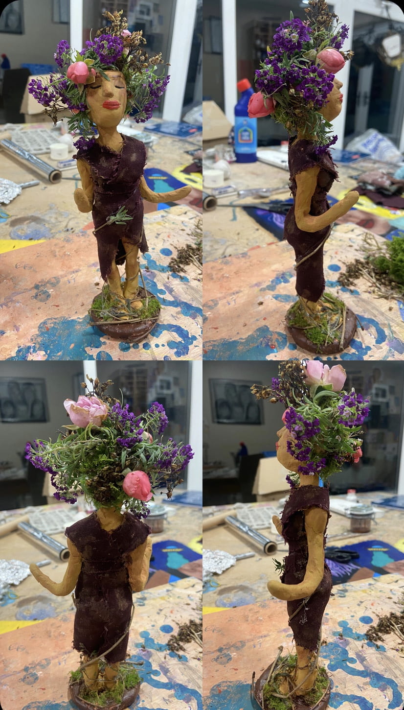
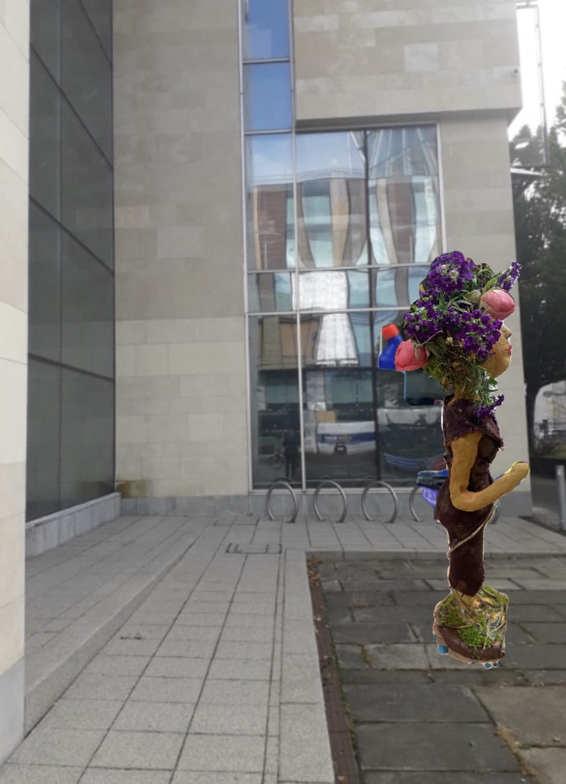
Our project for sculpture was to create a design for a statue/sculpture outside at Cathedral gardens, in the kid friendly park, there were some specifications we were to adhere to for example; to be based on man made or natural forms, to be an iconic visual experience that engages the audience, encourage curiosity and a sense of wonder. I began thinking about what these specifications meant to me, it led me to think about how humans are linked to nature and how we have lost our touch with it. I wanted to convey this so that it brought excitement and wonder whilst also representing a wider message.
The imagery I want to create to create this message is that of a woman, possibly standing in front of a tree, with roots collecting and wrapping around her feet and leaves and wildlife in her hair, I believe that it would be most influential if this statue was placed beside some flower beds to connect it to the plant life it depicts.
through my research I discovered that if I was going to make a sculpture for this location I would cast it in bronze as the I like the effect it gives as a classic sculpture from looking at sculpture artists Like Henri Matisse.
i created a mood board of inspiring images around my ideas, as well as some small, quick thumbnail sketches of what I want my sculpture to look like
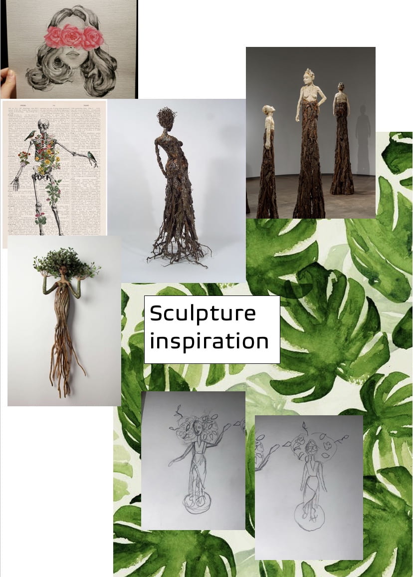
I also did some artist research to find some sculptors that I found influential to the style of my work.

I created a more in depth study of my idea as well to help me achieve My intended goal

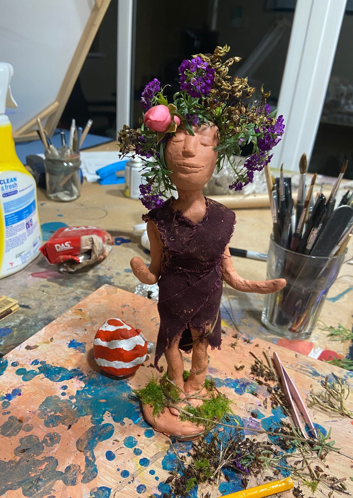
I began to work from tinfoil wrapped in clay to make the form of the woman, I had made some faces and heads from clay before however, I had never tried to create a body shape, I found this difficult but despite this I liked the look of it once I had put the tunic like Traditional style clothing on the model. I also went outside and found some plants and sticks that I could use to simulate roots and leaves of a tree, I used some flowers in the woman’s “hair” to add some colour to the mini sculpture even though I wanted it to be cast in bronze.

I am very happy with the finished project despite being skeptical as to whether it would turn out okay or not aesthetically, but in my opinion it is similar enough to my original drawing and sketches, which I found very helpful to refer back to when creating the final product.
I then downloaded a photo editing app and photoshopped some of the images I took of the sculpture into the foreground of a photo of the outside of the university.


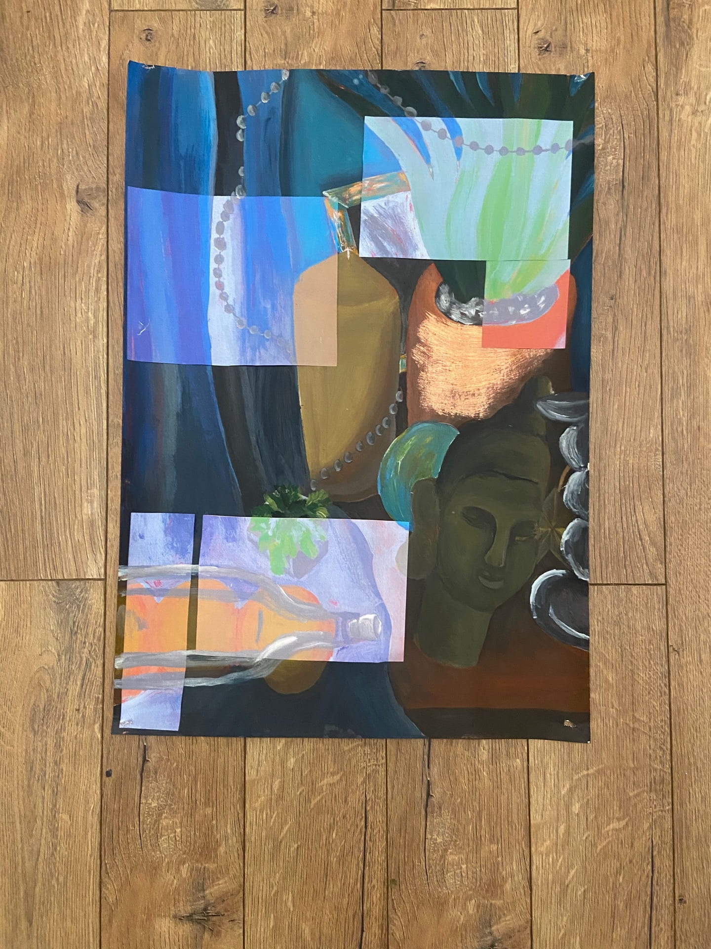
We had to chose some images and drawing that we had already created during the workshop to be references in our larger a2 studies.
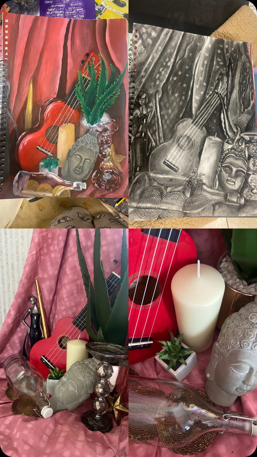
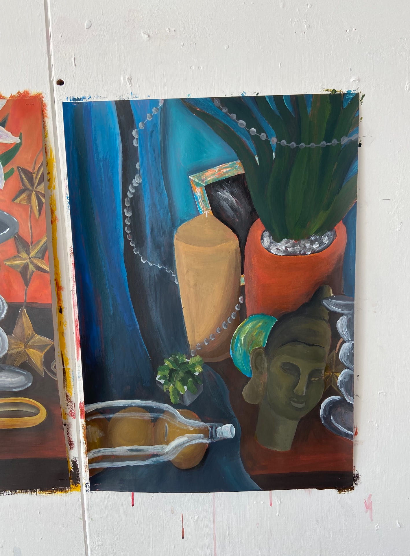
On A2 pieces of card we started by applying a ground which is a wash of colour in the background to help build the paint onto to avoid drawing out on white paper.

I started my paintings of the objects from different angles on my chose background colour using acrylic.


My original photos were slightly lacking so I decided to add and take out some objects to make my study more busy and interesting while trying not to add to much.


I then took my studies home and took some photocopies, however they came out a different hue of colour to my original piece which created problems for my original idea.
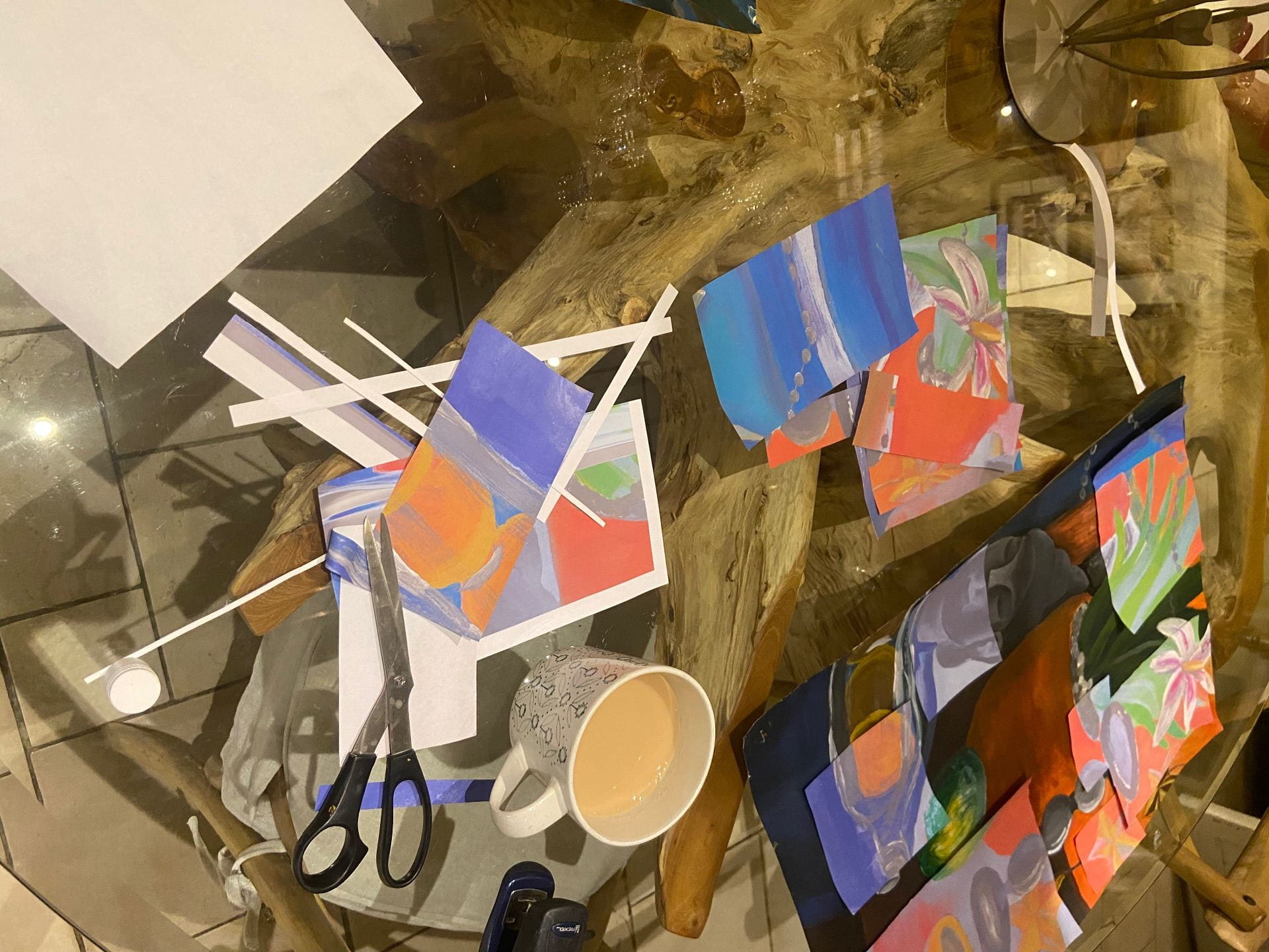
they came out much more vibrant and some of the colours were inverted, I decided to experiment with lay out and decided to have the photocopies contrasting the original piece to create an interesting and compelling composition.